Service experience & visual identity
Solitude Frog
An invitation to explore, at your own pace.
Discover the project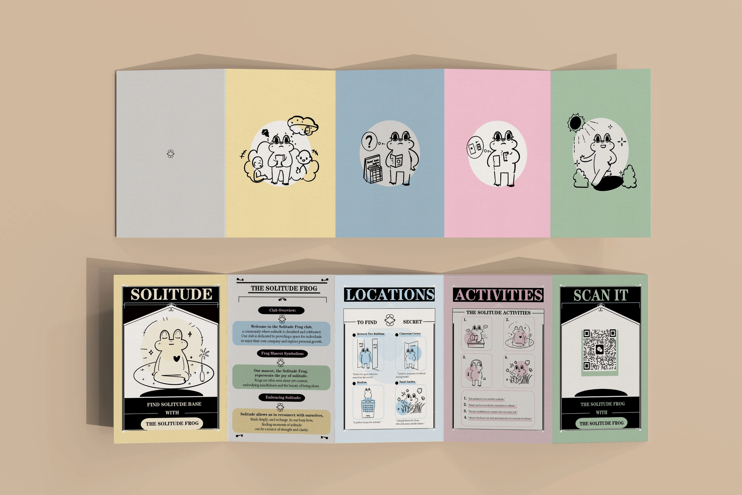
The project
Project overview.
Solitude Frog is an illustrated campus guide with a companion app. Students can find quiet places, explore activities and choose whether to join the community.
- Project type
- Academic project · Paper + digital prototype
- Focus
- Experience design
Illustration & printed guide
Mobile interface
01 / The experience
A campus journey,
at your own pace.
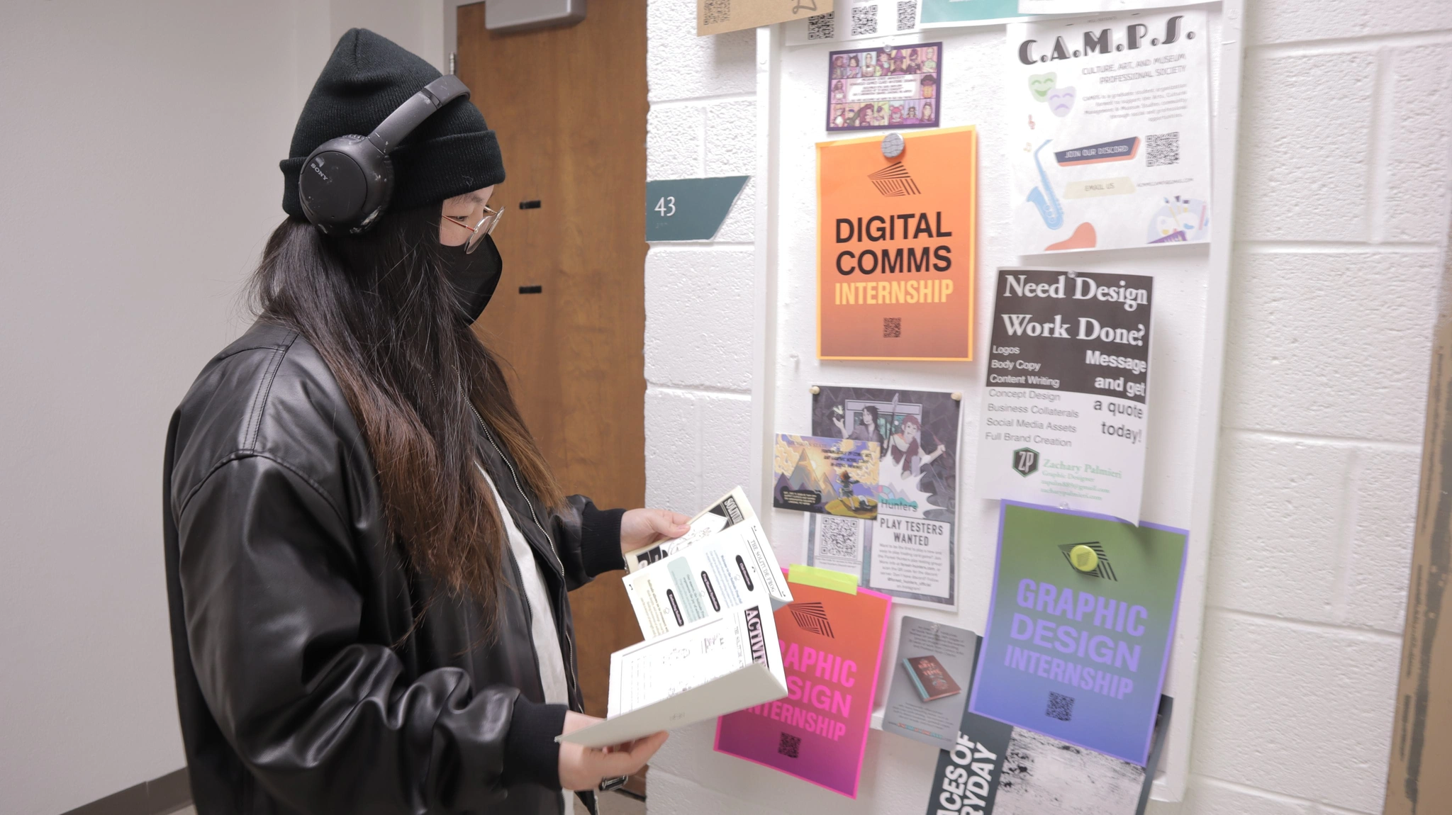
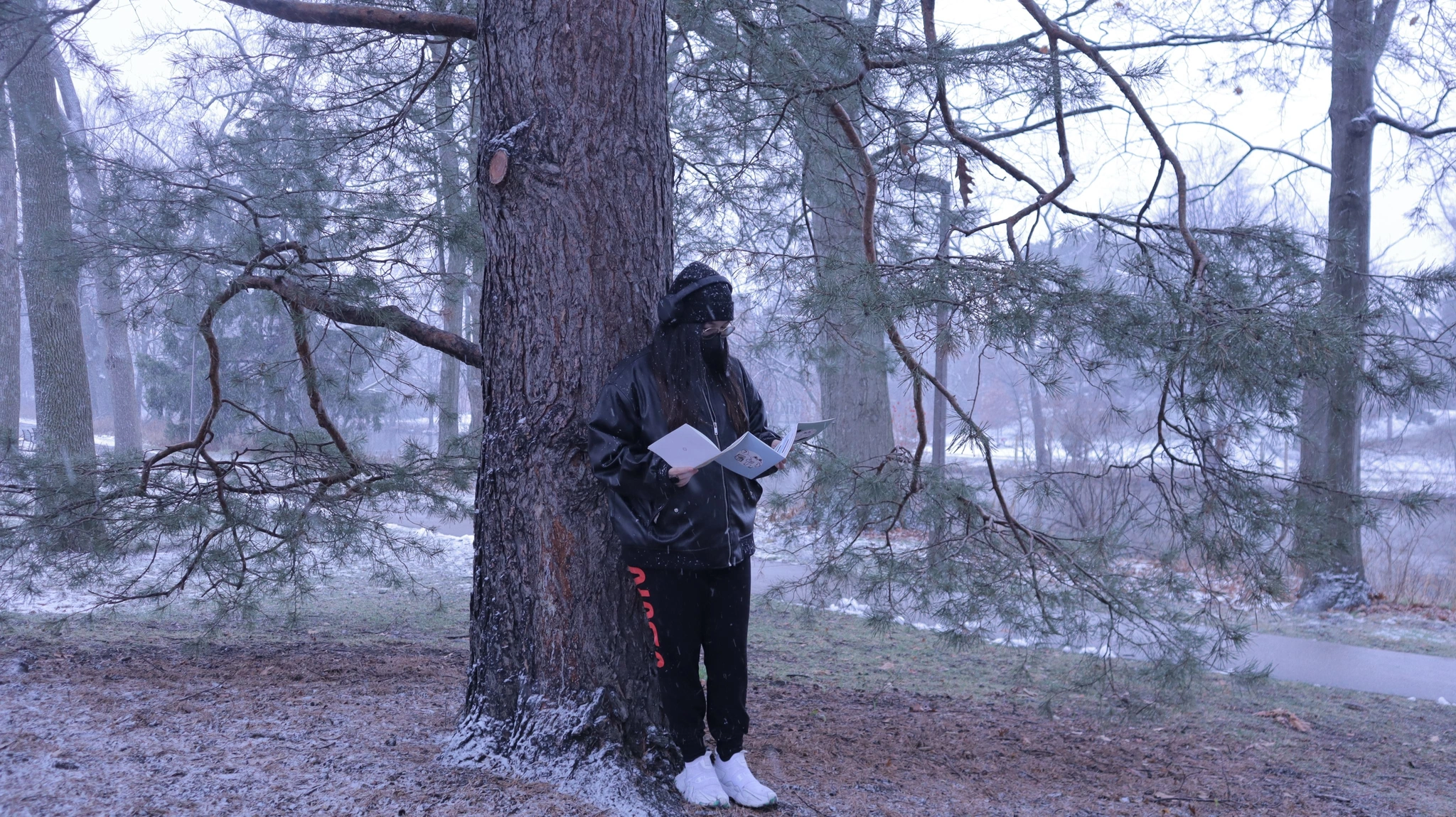
The booklet introduces quiet places on campus. The companion app adds a map, activity listings and a community area that students can choose to use.
- 01
Discover
Pick up the illustrated guide.
- 02
Choose
Find a place for time alone.
- 03
Explore
Use the guide and digital map.
- 04
Connect
Browse activities and community posts.
02 / The design choices
Time alone,
with ways to join in.
Start with a place
The research explored where students spend time alone. Campus locations became the starting point for the experience.
Make it approachable
A hand-drawn frog and a soft palette carry the identity across the guide and the interface.
Offer different ways in
Students can use the guide on its own, follow the digital map or explore community posts and activities.
Design guidelinesIdentity / Color / Typography+
A little company, without the pressure.
Connect the printed campus guide, hand-drawn frog and mobile companion through a shared palette, reading rhythm and gentle invitation.
The illustrations and screens remain the original project reference. Colors below are interpreted reference swatches; the editable type and layout rules are proposed extensions.
Keep the frog a little imperfect.
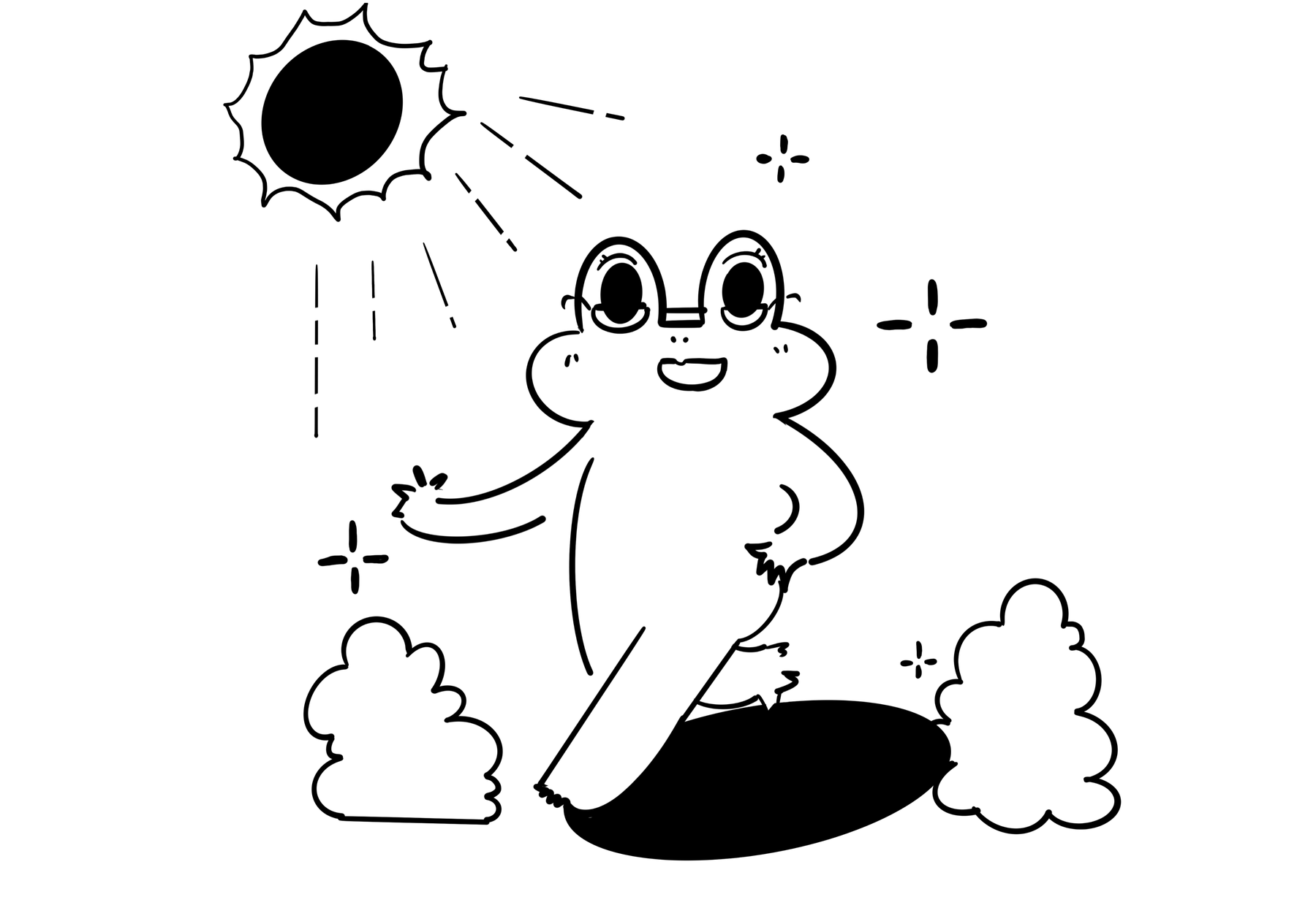
The tall oval eyes, soft body and uneven ink contour give the character its friendly manner. Use the original drawing as the master rather than replacing it with a glossy mascot.
- Silhouette
- Preserve the eye-to-body relationship and relaxed posture. Scale the complete drawing proportionally.
- Line character
- Retain the hand-drawn irregularity. Use simple, consistent line icons for navigation.
- Expression
- Keep the small smile and cheek details legible; do not make every emotion use the same face.
- Placement
- Give the character its own space. Keep eyes, copy and navigation away from folds and busy backgrounds.
A different color for each small invitation.
The printed guide uses pale yellow, blue, pink and green. Extend them as section cues, with dark ink and generous paper-colored space holding the reading together.
#F4E6ACWarm yellow / Welcome
A warm opening for an introduction or a small invitation.
#B9D8E8Mist blue / Places
Give quiet places and practical location information a recognisable section.
#E8BCD0Soft pink / Activities
Differentiate optional activities from wayfinding.
#BDD1B4Sage / Exploration
Link the campus setting with routes and the scan entry.
#F5F1E8Paper / Reading
Leave a quiet surface for longer copy and the frog illustration.
#181B18Ink / Structure
Use for text, outlines and labels across the print and digital extensions.
These section meanings are proposed within this project. Keep a written heading with every color; print colors need a physical proof rather than a direct HEX-to-paper assumption.
A readable color pair
Pair color with words or a visible symbol. Keep small labels on a quiet, solid surface.
#181B18 / #F4E6AC · 13.87:1An expressive title, with Inter for the explanation.
The portfolio title “Refuse To Read The Air” uses Patua One. Inter carries the project explanation, with changes in weight to distinguish labels from reading copy.

Patua One + Inter
Figma confirms Patua One Regular at 44 px for the project title and Inter for the “Goal” text layer. The SOLITUDE booklet lettering shown here is embedded artwork; its separate font family is not established by those text layers.
| Text role | Source size | Typeface / style | Original text |
|---|---|---|---|
| Project title | 44 px | Patua One / Regular | Refuse To Read The Air |
| Project explanation | Mixed | Inter / mixed styles | Goal: The design aims… |
Keep the portfolio typography distinct from the embedded booklet and app artwork. Preserve their original lettering until the editable source establishes its typeface.
These are source-board measurements, not website or installation text sizes. View the original Figma file ↗
03 / Paper & screen
One identity.
Two ways to explore.
A guide to take along.
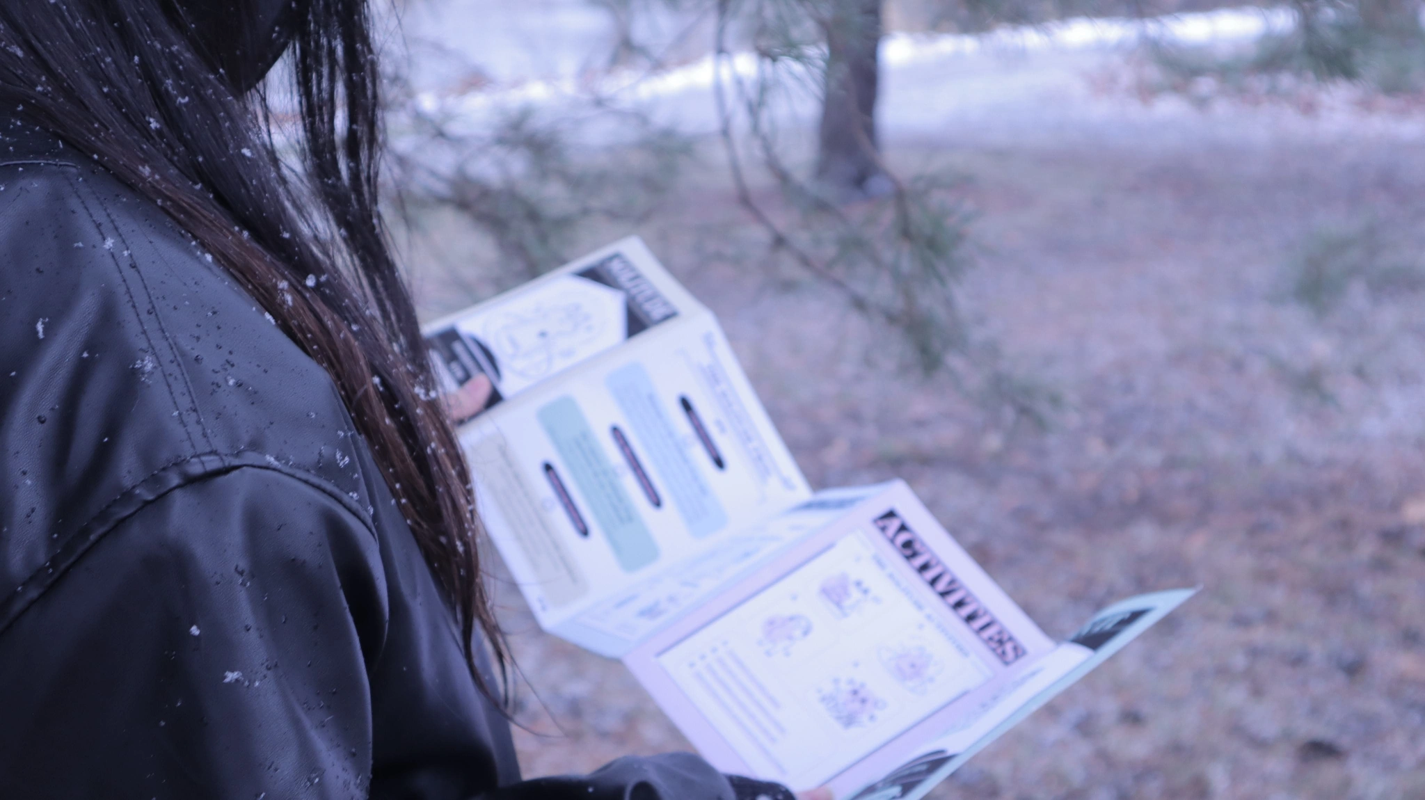
The folding booklet includes locations, activities and a QR code that opens the digital experience. Students can use the printed guide before deciding whether to open the app.
Design guidelinesMaterials & views / Use & avoid+
One story, on paper and on a screen.
Paper invites slow browsing; the phone helps someone find a place or activity. Preserve the illustration language while adapting the amount of information to each surface.
Printed guide
Prefer a low-glare reading surface. Choose paper weight and fold direction after testing the actual five-panel format.
Digital cards
Keep flat color surfaces and editable text as separate layers. Avoid adding simulated paper noise behind small labels.
Illustration
Use a clean source export with its original line quality. Keep the surrounding space plain.
Surface samples are schematic illustrations of the proposed appearance.
Show the fold and the reading order.
For a printed guide, front and back spreads plus a folded view communicate more than industrial three-view drawings. The diagram below is a reading-order sketch, not a production dieline.
Reading sequence / five panels. No production dimensions implied.
- Front spread
- Show cover, introduction, places, activities and the scan entry in the intended sequence.
- Back spread
- Align the reverse panels to the actual folds. Keep headings and important character details clear of fold lines.
- Folded state
- Check the first visible panel, opening direction and how the guide sits in one hand.
- Print proof
- Check text, ink contrast and QR scanning at final size before specifying the final stock.
Keep the character of the work.
These examples make the application rules visible. All distorted or crowded samples below are labelled as things to avoid.
Keep the original drawing
Use clean artwork and let its uneven line carry the personality.
Avoid stretching the frog
Do not squash the eyes or widen the body to fit a card.
Pair icons with labels
Use the same named destinations throughout mobile navigation.
Avoid copy over illustration
Put reading copy on a quiet surface instead of across a face or a busy drawing.
Protect the reading order
Check both folded and fully opened states.
Avoid critical details on folds
Keep QR codes, place names and facial details inside the safe panel area.
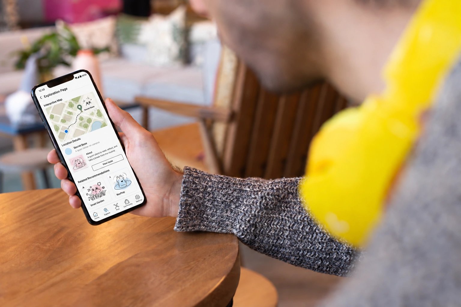
A companion app.
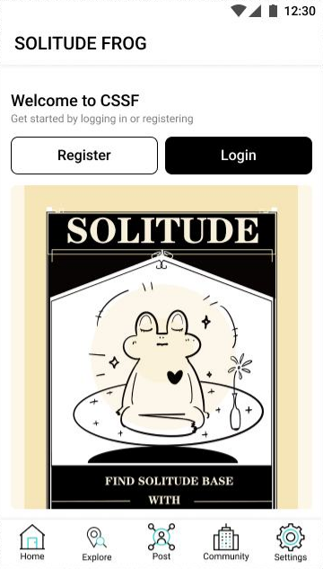
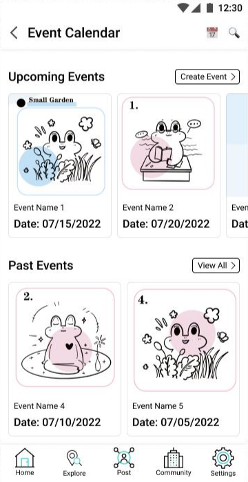
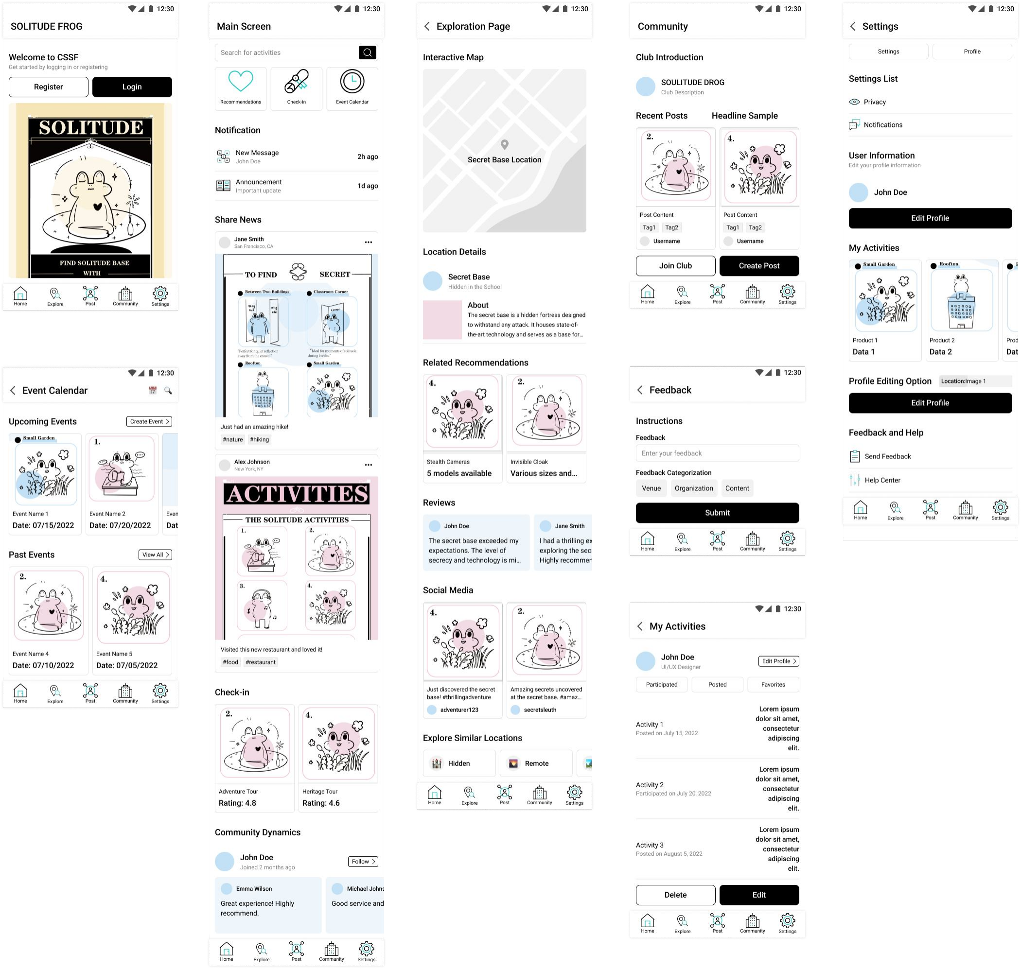
The app provides location details, activity listings and community pages. Its illustrations and colors follow the printed guide.
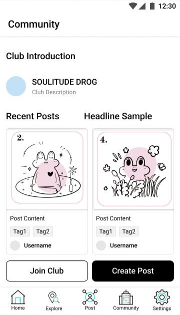
View the complete interface study
Design guidelinesApplications+
Find a place. Join when you feel ready.
Retain the original Home, Explore, Post, Community and Settings navigation. New screens should keep those destinations stable and make permissions or participation choices explicit.
A welcoming entry with a clear next step and room for the frog.
Show time, place and what participation involves before asking someone to join.
Support reading and browsing; participation stays an invitation.
Suggested behavior & continuity
Browse
Let people understand the places and activities before asking for a contribution.
No matches
Offer another category or nearby place without turning the empty state into a failure.
Location optional
Allow a manual campus or place search if location access is declined.
Join voluntarily
Explain the activity and let the person choose their next step.
04 / In the field
Find a quiet place
on the map.
The updated location screen combines a campus map, place details and illustrated recommendations to help students find places introduced in the guide.