Shape & depth
4 px1 px
Borders, surfaces and depth.
Tags use a 4 px radius. Fine borders separate content, images keep their ratio, and dialogs use a backdrop.
Ning Zhou / Portfolio website
A shared design system for this portfolio.
Shared typography, components and navigation for the portfolio’s pages.
Shared / In this library
Typography, controls, artwork frames, lighting, opening scenes and navigation, collected from the portfolio website.
Project / Within each case study
Product screens, task flows, states and iterations are presented within each project, with their own design language.
01 / Foundations
Shared colour, type and spacing. Each project page can have its own accent.
Moonlit is the default accent; the others identify project pages. App colours and component rules remain within their respective case studies.
#090F10#111919#EEE9DF#AAB3B0Typography
Headings pair Newsreader with Source Han Serif at a regular weight. Chinese headings use natural character spacing. Body copy and navigation use Hanken Grotesk and Source Han Sans. These OFL fonts are hosted with the site. Artwork, logos and product screens retain each project’s original typography.
Display · 32–53 / 1.18Body · 17 / 1.8Secondary · 15 / 1.75UI · 14 / 1.5Caption · 13 / 1.65Label · 12 / 1.5Shape & depth
Tags use a 4 px radius. Fine borders separate content, images keep their ratio, and dialogs use a backdrop.
Icon & ornament
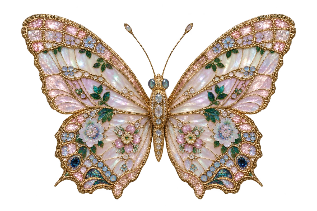
Arrows indicate direction, and close and expand icons identify actions. Decorative frames and butterflies sit alongside clearly labeled controls.
Type in context
Body text explains the design; captions add context. Use full paragraphs to check reading rhythm at 17 px on desktop and 16 px on mobile.
01 / A wearable and companion app.02 / Website components
Shared website components, grouped by purpose. Each comes with usage notes and a working preview.
显示 22 个组件
No matching components. Try “button”, “image”, or clear your search.
04 / Page patterns
FellouAI demonstrates a project-page composition: heading, body, brand image and project facts.
01 / FellouAI · Brand & launch
Logo studies, launch visuals, communication materials and website recommendations for an AI product.
Explore FellouAI
Covers and framesFrames follow image proportions. Keep subjects intact and captions outside, allowing long captions to wrap.
Website structure and project contentKeep website type and spacing consistent. This example uses FellouAI’s lavender accent while the brand image retains its own colours.
05 / Motion & feedback
Try the site’s hover effects, image previews and messages. Each demo explains how it starts, responds and ends.
Hover or focus with Tab; click to replay the fade.
Motion respects the system’s reduced-motion preference. With animation off, colour and focus feedback remain.
Study 01 / Text action
Study 02 / Image dialog
Ready to open the preview.
Study 03 / Toast feedback
Copy the project link to share it in a message or email.
Try copying the link below.
More states
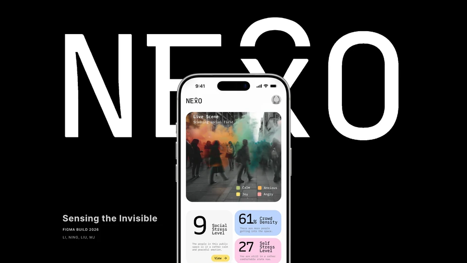
Wearable & companion app
Action → resultSuccess confirms the copy. If automatic copying is unavailable, select the link and copy manually.
Time to readMessages dismiss after 5.5 seconds; hover or focus pauses the timer. The card retains the result after the toast disappears.
Compare other statesSimulate success, error, loading and stacking, or change position. These state demos do not copy anything.
The copy button uses the current site URL shown above. This independent JavaScript component is inspired by Sonner; it does not use the React package.
06 / Signature interactions
Each interaction includes its purpose, structure, states and usage notes. Try individual components, then view them together on the homepage.
Reference study / Kaiwen Tang
A shared outline glides between labels and resizes to their width. The text grows gently; the outline stays behind it.
Brand identities, digital products and interactive experiences.
Purpose
A shared outline follows hover and keyboard focus. Clicking a tab changes its content; hovering only previews the target.
Anatomy / What it is made of
| State | Trigger | Response |
|---|---|---|
| Rest | Pointer outside | Outline returns to the selected label. |
| Preview | Hover or keyboard focus | Move and resize the outline; enlarge the label slightly. |
| Selected | Click, or arrow-key selection | Update the panel and the selected state together. |
Use for a small set of related tabs. Keep the outline behind the labels and leave enough space between targets.
Arrow keys, Home and End work without a mouse. Reduced motion removes travel; selection and content remain available.
library-signatures.js / initSlidingHighlight · reference studyWebsite pattern / Work
Move between projects. The images slide inside one frame, which changes size with the cover. Switch the lamp off, or focus a row to redirect its light.
Purpose
Display project covers in a shared frame that adjusts to each image’s proportions.
Anatomy / What it is made of
| State | Trigger | Response |
|---|---|---|
| Loading | Cover dimensions unavailable | Use a provisional ratio, then measure the loaded image. |
| Resizing | Select a differently shaped cover | Animate width and height on the existing frame. |
| Constrained | Small screen or tall image | Reduce the whole frame to fit the stage; keep the image ratio. |
Use for the portfolio’s curated Work list. The Stone Roses uses its existing art-directed crop; other covers retain their intrinsic ratio.
On narrow screens, the frame moves below the list. Titles and captions remain outside the clipped artwork.
work-hover.js / sizeFor · work-hover.css · library-signatures.js / layoutPurpose
Slide between project covers while keeping the same frame on screen.
Anatomy / What it is made of
| State | Trigger | Response |
|---|---|---|
| Ready | First image available | Show one cover; keep other slides outside the aperture. |
| Moving | A different row becomes active | Translate the existing track; never fade the whole frame out. |
| Interrupted | Another row activates mid-transition | Retarget from the current visual position. The latest selection wins. |
Try moving directly from the first to the last project. The frame, mat and caption location stay stable while the selected artwork changes.
With reduced motion, switch directly to the chosen cover. On touch screens, tap a row; the next-artwork button is also available.
work-hover.js / track · library-signatures.css / .sig-art-trackPurpose
Point the reading light toward the active project. The title and selection marker also identify the current work.
Anatomy / What it is made of
| State | Trigger | Response |
|---|---|---|
| On | Switch enabled | Draw a soft gradient from the lamp to the active row. |
| Aiming | Hover, click or keyboard focus | Ease toward the new row, preserving the lamp position. |
| Off | Switch disabled | Hide the beam; preserve the title, marker and selected artwork. |
Use one light source for one list. A beam should support the reading hierarchy without washing out the lettering.
Keyboard focus aims the light too. When motion is reduced, the beam changes direction immediately. Selection remains readable with lighting off.
work-light.js / aim · library-signatures.js / paintBeamPurpose
Open a larger image, then return to the same selected project and reading position.
Anatomy / What it is made of
| State | Trigger | Response |
|---|---|---|
| Preview | Work selected | Keep a clear route to the larger image. |
| Focused | Click the frame | Open the dialog and move keyboard focus into it. |
| Returned | Close button, backdrop or Escape | Close and restore focus to the frame, with the same work selected. |
This specimen isolates image inspection. The homepage combines the frame with its full project-entry transition; inspect that composition in the context preview.
Provide a visible close button and project link. Large images scroll within the dialog; closing never resets the Work list.
library-signatures.js / dialog · work-hover.js / work-zoomComponent studies / Homepage
Try the entrance, scroll movement, flowers, reading panel and navigation separately. The full homepage preview below shows how they fit together.
Purpose
Open the curtain to enter the portfolio. The entry button remains separate from the decorative cloth.
Anatomy / What it is made of
| State | Trigger | Response |
|---|---|---|
| Closed | Initial visit | Offer the entry action; avoid activating hidden controls. |
| Opening | Click or entry gesture | Run one opening sequence; repeated input does not stack animations. |
| Open | Sequence completes | Release reading and navigation. Reset is available in this study. |
The specimen isolates the trigger and two moving layers. The real homepage adds cloth physics, the river and the camera sequence.
Provide keyboard activation and respect reduced motion. Direct chapter links should not force readers through the entrance again.
curtain-journey.js + curtain-cloth.jsPurpose
Connect the river and window scenes to the same scroll progress, so the transition works in both directions.
Anatomy / What it is made of
| State | Trigger | Response |
|---|---|---|
| River | Early progress | Prioritise the outside scene and first introduction. |
| Transition | Middle progress | Blend transforms from the same progress value. |
| Window | Late progress | Settle the composition and reveal the flower interactions. |
Drag the progress control in either direction. The layer diagram exposes the relationship; the context preview retains the full visual sequence.
With reduced motion, present the settled window composition and retain navigation. Information must not depend on finishing an animation.
moon-opening.js / render · --opening-motionPurpose
Use each flower as an entry to a profile topic. A label and glow identify it on hover or keyboard focus.
Anatomy / What it is made of
| State | Trigger | Response |
|---|---|---|
| Available | Window settled | Show an identifying number at the flower. |
| Highlighted | Hover or focus | Reveal the topic name and a soft inner glint. |
| Expanded | Select flower | Mark the active flower and open its profile panel. |
The numbered target must stay distinguishable from the artwork. Use a short, meaningful accessible name for every flower.
Touch selects directly. Keyboard focus reveals the same name and glow; do not rely on hover alone to communicate the topic.
moon-opening.css / .flower-hit · nacre-depth.jsPurpose
Reveal a short introduction near its origin, then return the reader to the same flower and scroll position.
Anatomy / What it is made of
| State | Trigger | Response |
|---|---|---|
| Closed | No active flower | Keep the page clear for exploring. |
| Reading | Select a flower | Show its topic and keep the origin marked. |
| Swapping | Previous or next topic | Update the body and counter without rebuilding the whole scene. |
Keep the first paragraph concise. Pause distracting ambient movement while a reader is inside the panel.
On small screens, use a full-width panel with bounded height and internal scrolling. Closing restores focus to the opening flower.
moon-opening.js / openPreview + closePreview · flower-profile.cssPurpose
Show the current chapter and provide direct links to the other sections.
Anatomy / What it is made of
| State | Trigger | Response |
|---|---|---|
| Collapsed | Menu closed | Keep a recognisable trigger in the page gutter. |
| Expanded | Activate the toggle | Show named chapter targets and the current item. |
| Current | Scroll or select a chapter | Update the marker and aria-current from the actual position. |
Keep the directory clear of the butterfly and project content. The isolated preview lets you select chapters without scrolling the documentation.
Retain visible names when the menu is expanded on touch screens. Closing the menu never resets the current chapter.
moon-opening.js / index toggle · motion.js / chapter-railPurpose
The butterfly links to the next chapter and moves along the page as the reader scrolls.
Anatomy / What it is made of
| State | Trigger | Response |
|---|---|---|
| Perched | Scroll settles | Settle into a quieter wing pose. |
| Travelling | Progress changes | Move toward the next position and turn slightly with the travel. |
| Activated | Click or keyboard activation | Continue to the next chapter and update the destination label. |
Use the butterfly as a secondary route; the directory remains available for direct navigation. Keep explanatory copy outside its flight path.
Reduced motion fixes the guide in a stable position and stops wing movement. The next-chapter action remains usable.
motion.js / pathAt + butterfly · motion.cssPurpose
Use light, ripples and subtle movement to add detail to the scene. Essential information remains in the page content.
Anatomy / What it is made of
| State | Trigger | Response |
|---|---|---|
| Idle | No interaction | Keep the scene calm. |
| Responding | Pointer movement or explicit action | Play a bounded response and remove its temporary layer afterwards. |
| Reduced | System or user preference | Keep the material image and functional controls. |
The specimen isolates a short ripple. The homepage combines water, cloth, petals, boat movement and lighting; inspect the full composition only after its parts.
Stop optional motion when requested. Sound requires a user gesture; it is never required for understanding or navigation.
motion.js / water-ring · petal-fall.js · window-storm.js · boat-motion.jsThe full composition combines the components above. Load it only when you want to compare the complete experience.
Click the curtain or scroll down to enter. The scene opens into the river before moving back toward the window.
Starts only when you choose to explore.
The preview is ready to load.
Interaction design / Reading preferences
Choose light or dark mode, and switch between English and Chinese.
Appearance
The page colors change gradually with the watch’s movement, keeping your reading position.
Dark modeThe portfolio opens in dark mode and remembers your choice. Reset preferences restores dark mode and the browser’s preferred language.
Purpose
The watch’s movement connects light and dark modes through a gradual color change. Its floral cover and gold case echo the homepage garden and artwork frames.
Anatomy / What it is made of
| State | Trigger | Response |
|---|---|---|
| Ready | Before activation | The appearance control is available; the watch is hidden. |
| Swinging | Click, Enter or Space | The watch swings closer as the page colors change, then fades out. |
| Finished or skipped | End of motion, Escape or Skip | The selected appearance stays in place. The watch disappears and focus returns to the control. |
The animation plays when a visitor changes appearance. The first visit uses dark mode; later visits keep the saved choice, independently of system appearance.
Select Skip animation or press Escape to finish immediately. Reduced motion disables the animation. If the browser cannot show the transition, it uses a color fade or changes appearance directly.
reading-objects.js / change · reading-objects.css / .reading-clock-overlay · assets/reading-objects/floral-pocket-watch-v1.pngPurpose
The plaque switches between English and Chinese. Its turn confirms the change while keeping the current appearance.
Anatomy / What it is made of
| State | Trigger | Response |
|---|---|---|
| English | English resolved | EN faces forward. Select it to switch to Chinese. |
| Chinese | Chinese resolved | 中 faces forward. Select it to switch to English. |
| Turning | Select the plaque | The plaque turns 180° and the page text updates. |
Keep the language labels visible. Follow system uses the browser’s preferred language.
Use Enter or Space to activate the button. Reduced motion changes the language without a turn. Text wraps to fit the selected language.
reading-objects.js / plaque · reading-objects.css / .reading-plaque · site-preferences.js / readingAnchor07 / Website playground
Switch website width, component state and accent colour. Settings affect only the preview; mobile shows the website’s narrow layout.
Project introduction · Moonlit · Desktop website
08 / In use & guidelines
Load design tokens and component styles. Wrap the page content in .nz-scope. Moonlit is the default accent.
<link rel="stylesheet" href="portfolio-tokens.css?v=850109dd80e3">
<link rel="stylesheet" href="portfolio-components.css?v=e1ba7cdd7cf4">
<main class="nz-scope" data-nz-theme="default">
  <!-- 粘贴组件代码 -->
</main>Shared controls include copyable HTML. Signature studies link to their source files and live scenes. Image dialogs use the initializer; disclosures use native browser behavior.
<script type="module">
  import { initPortfolioComponents }
    from './portfolio-components.js';
  initPortfolioComponents();
</script>The kit includes toast styles, a standalone module and a working example. Load the tokens and these files, then connect the trigger to a real action.
<link rel="stylesheet" href="portfolio-toast.css?v=991953e2c449">
<script type="module">
  import { createToastRegion } from './portfolio-toast.js';
  const feedback = createToastRegion();
  // 在实际操作完成后调用:
  feedback.show({ type: 'success', title: '代码已复制' });
  // 异步操作:show({ type: 'loading', ... }) 返回 id,
  // 完成后调用 feedback.update(id, { type: 'success', ... })。
</script>The homepage links to this library. Typography is shared across the site, and the copy-link demo uses the toast component included in the kit. Project pages also use their own layouts and scripts. The kit contains web components; native Figma components are not included.
Arbor ↗: a progression from foundations to components and page patterns.
Radix Themes ↗: theme switching and side-by-side states.
Sonner ↗: working demos and clear behaviour notes. The visuals and examples follow this portfolio.