Brand & launch communication
FellouAI
Giving an AI product a clear, consistent launch presence.
Discover the project- Period
- June–September 2025
- My role
- UI design internship · Brand & launch visuals
- Collaboration
- Product, marketing & operations
The project
Project overview.
Brand and launch communication for FellouAI (now Eazo), including wordmark studies, feature posters, release graphics and community campaign materials. The designs use a consistent identity to explain product features and invite participation.
- Project background
- FellouAI is an agentic browser: given a single instruction, it plans and completes multi-step tasks on the web, with the process open to review and intervention at any point. The category had no established visual references, so the brand had to set the perception at launch: not another chat tool, but a system that executes on its own and keeps its process transparent. The visual goal was for users to read it as controllable, trustworthy and capable of getting things done.
- Project type
- AI product
- Focus
- Identity exploration
Product storytelling
Campaign & merchandise
My role / June–September 2025
Brand work for a product launch.
During my UI design internship at FellouAI, I worked with product, marketing and operations on brand and launch communication. My responsibilities included the updated CE logo and launch key visuals.
I also developed reusable logo, color, poster and video guidelines, and adjusted messaging and channel choices in response to audience feedback.
01 / Identity exploration
An iridescent ring,
a clear wordmark.
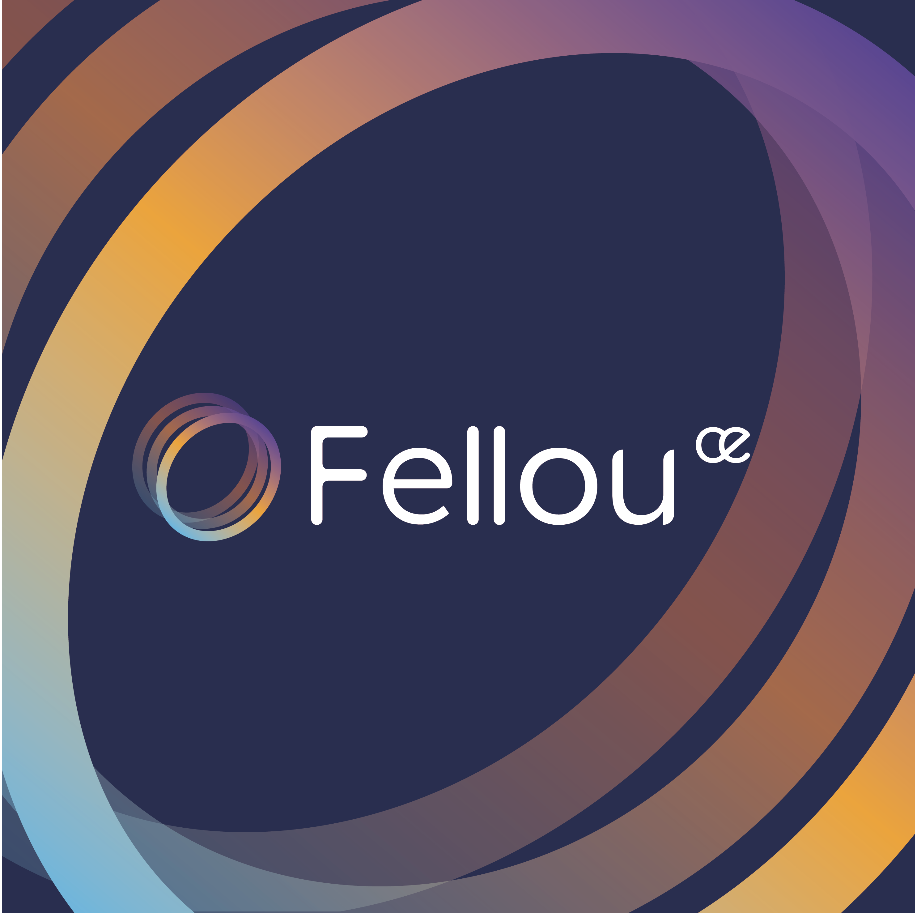
The identity pairs an iridescent ring with a simple wordmark. Gold, violet and blue color studies explore the mark, while enlarged loops provide supporting graphics for layouts.
Designing the CE version
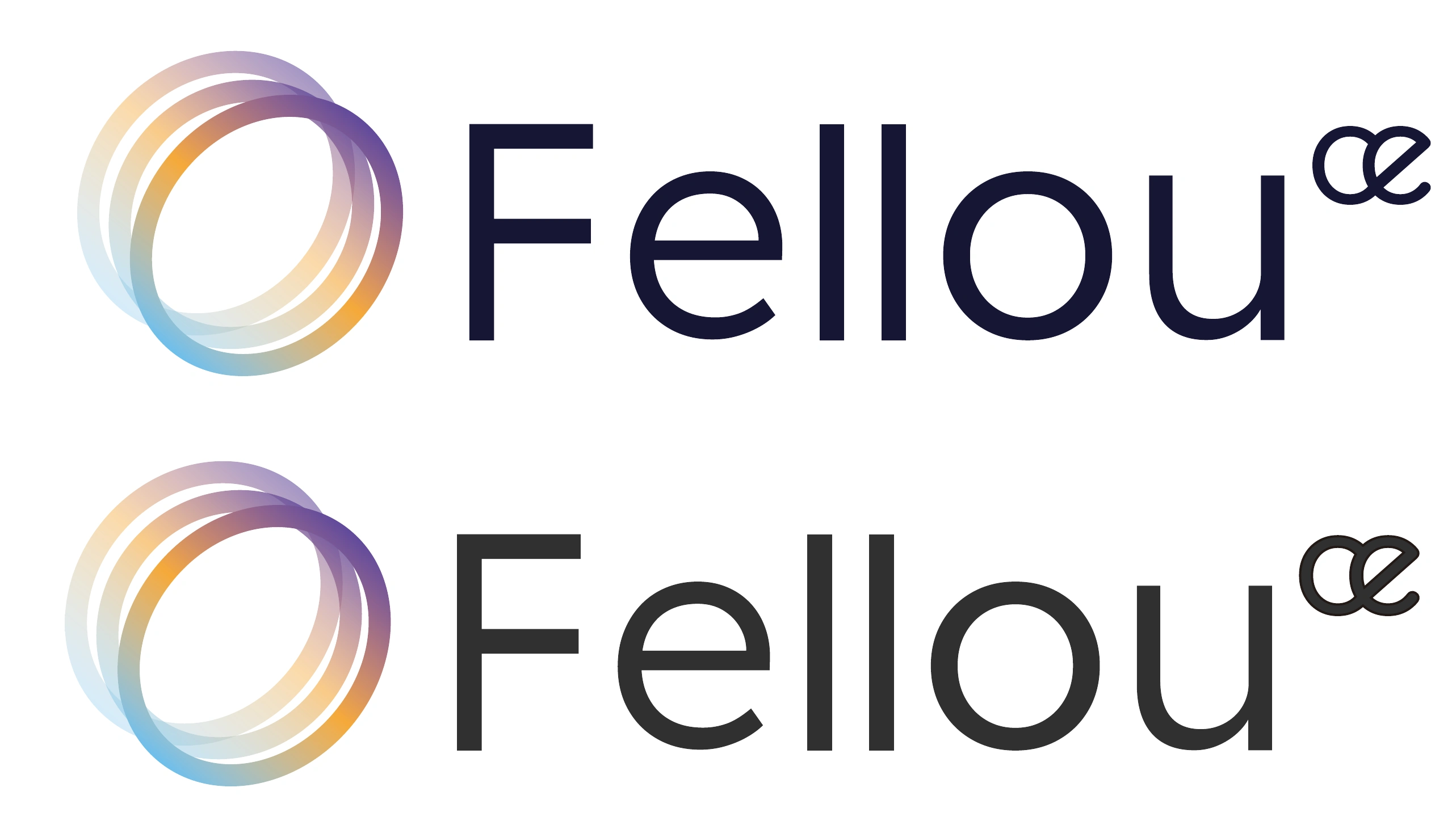
I designed the CE version of the FellouAI logo. It retains the relationship between the ring and the Fellou wordmark, with the focus on fitting CE into the mark so the version is clear and the whole composition feels balanced.
- Position of CE
- CE sits at the upper right of the Fellou wordmark at a smaller scale. The eye moves from the ring to Fellou, then to CE, keeping the version visible without competing with the name.
- Connected letterforms
- The lowercase c and e meet in a compact, curved form. Their rounded contours echo the letters in Fellou, making CE feel like part of the wordmark rather than a separate text label.
- Color within the lockup
- CE and Fellou share one solid color, shown here in midnight blue and charcoal. The gold, violet and blue stay in the ring, keeping the lettering simple beside the gradient.
- Using the complete mark
- The ring, Fellou and CE stay together, with their spacing and proportions preserved. In posters, the supporting ring can grow or extend beyond the edge while the complete CE logo remains readable.
Design guidelinesIdentity / Color / Typography / Use & avoid+
A consistent language for a product launch.
A guide to the ring, product posters, campaign hierarchy and badge applications developed for FellouAI.
The ring, the wordmark and space around them.
Treat each existing lockup as one composition. A larger orbital band may frame a layout, but the small identifying mark must stay complete.
- Master artwork
- Keep the ring-to-wordmark relationship, custom letter shapes and corner detail. Do not retype the logo.
- Clear space
- Suggested extension: leave at least half the ring diameter around the complete lockup. Measure from visible artwork.
- Small-scale use
- Begin testing the full lockup at 160 px wide. Below that, inspect ring gaps and fine details before approving an export.
- Variant control
- Choose one light or dark variant per composition. Keep exploration variants labelled rather than presenting all as final standards.
A quiet foundation for an iridescent mark.
Dark blue and charcoal organise the information. Violet, gold and cool blue belong mainly to the ring and supporting graphics, where they suggest motion and connection.
#292E4CMidnight / Brand field
Keeps the white wordmark and translucent ring distinct without a pure-black void.
#222222Charcoal / Product story
A stable background for feature headlines and layered interface excerpts.
#A995EAViolet / Continuity
Connects release graphics, campaign accents and badge details. Use it selectively.
#F2B84BWarm gold / Ring highlight
A warm counterpoint inside the spectrum; it is not a second primary button color.
#79BDD4Cool blue / Ring transition
Balances the gold and violet while preserving the continuous spectral movement.
#FFFFFFWhite / Legibility
For the reversed wordmark and concise headlines on dark fields.
These digital reference colors organise this guide and are derived from the existing visual direction. The ring retains its original multicolor artwork; a six-color list cannot replace that gradient.
A readable color pair
Pair color with words or a visible symbol. Keep small labels on a quiet, solid surface.
#FFFFFF / #222222 · 15.91:1Adelle Mono, in the poster study.
The editable poster study identifies Adelle Mono Semibold. Its monospaced rhythm gives the headline a structured, technical character. Preserve the separate, custom logo artwork.
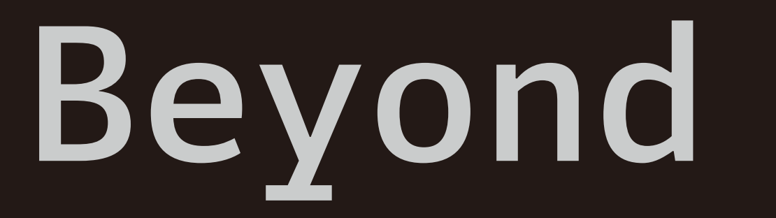
Adelle Mono Semibold
The sample is rendered from the supplied poster study. Completed posters are supplied as images; this finding does not establish their font family or a company-wide type standard.
| Role | Size / line height | Source weight | Application |
|---|---|---|---|
| Campaign heading | 32–56 / 1.1–1.2 | Retain original | One feature or benefit; no competing second headline. |
| Supporting line | 18–22 / 1.45 | Retain original | Explain the task in one short sentence. |
| Reading copy | 14–16 / 1.6 | Retain original | Instructions, participation steps and supporting explanations. |
| Metadata | 12–13 / 1.5 | Retain original | Version, date and source labels. |
Keep the original headline character and logo proportions. The sizes below are layout starting points only; preserve the corresponding source weight rather than converting every title to Bold.
Keep the character of the work.
These examples make the application rules visible. All distorted or crowded samples below are labelled as things to avoid.
Keep one reading path
Headline → feature demonstration → supporting detail.
Avoid competing effects
Do not place the headline over a busy ring, glow and interface stack at the same time.
Keep the mark intact
Crop the supporting orbit, not the identifying lockup.
Avoid stretching
Do not flatten screenshots or distort the custom wordmark.
Keep the signature together
Keep the product name with its identifying mark. Give both enough contrast at the final display size.
Avoid unreadable microcopy
If interface details are too small to read, show a focused crop and offer the full-size image.
02 / Product storytelling
Product features,
explained in posters.
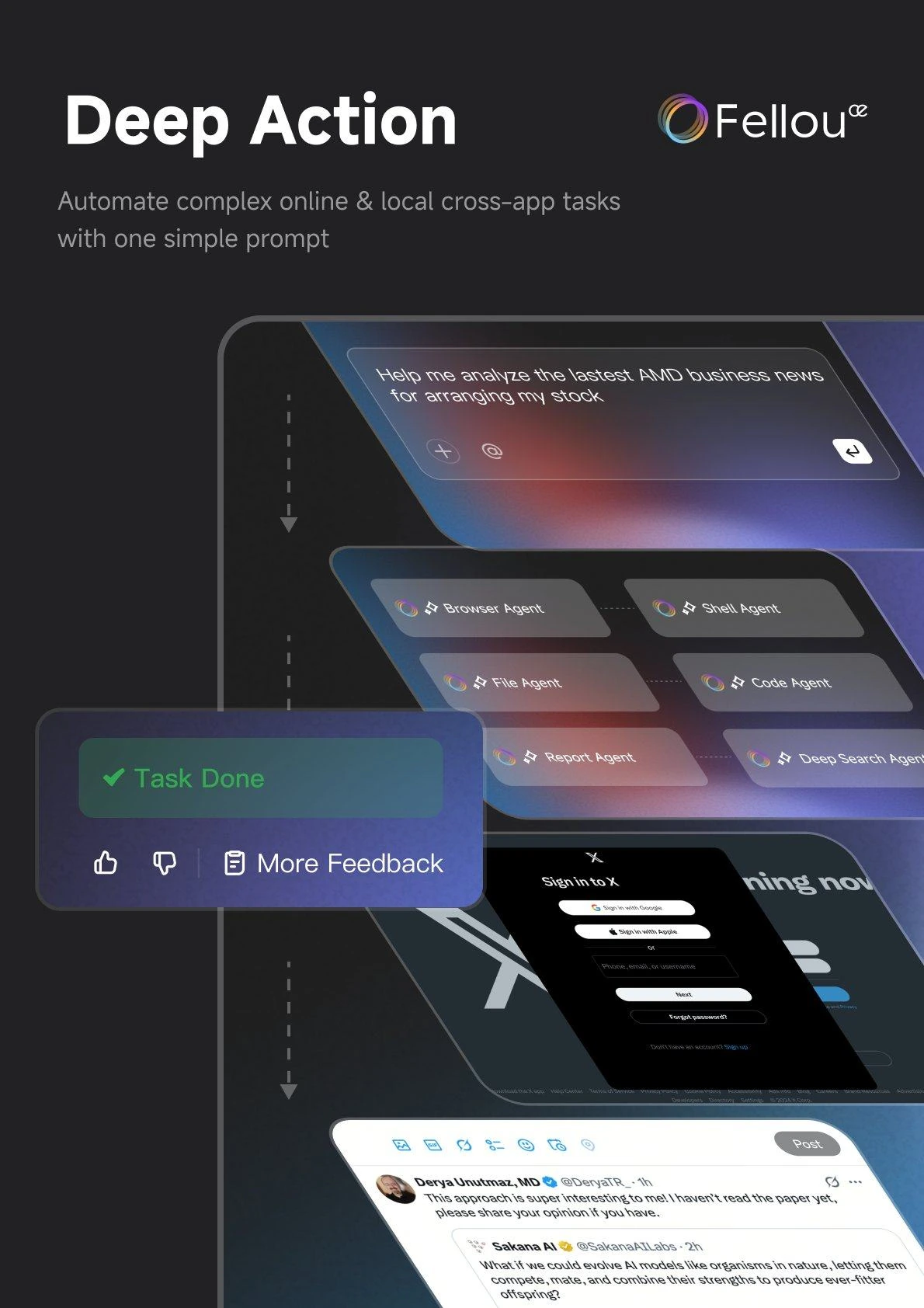
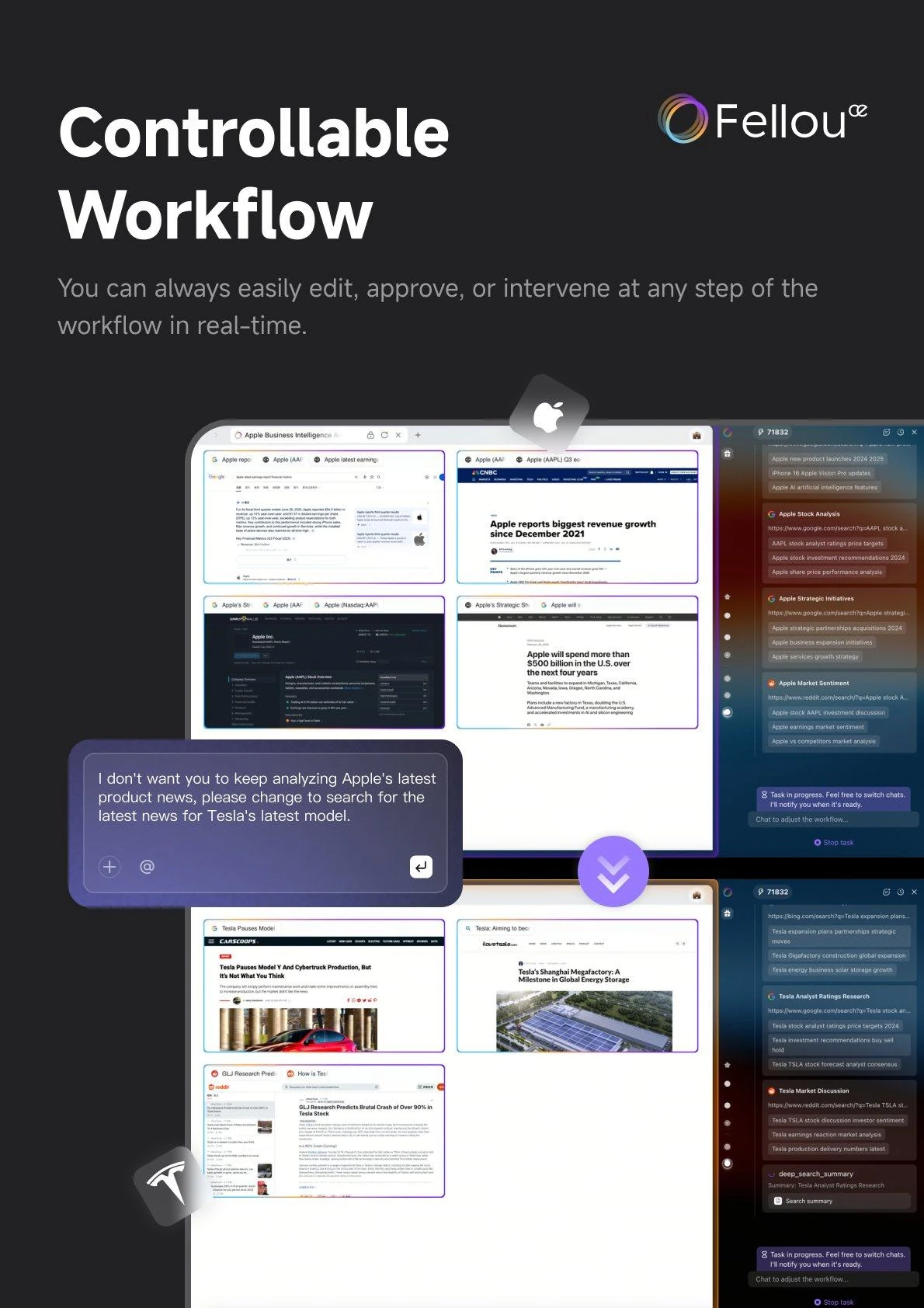
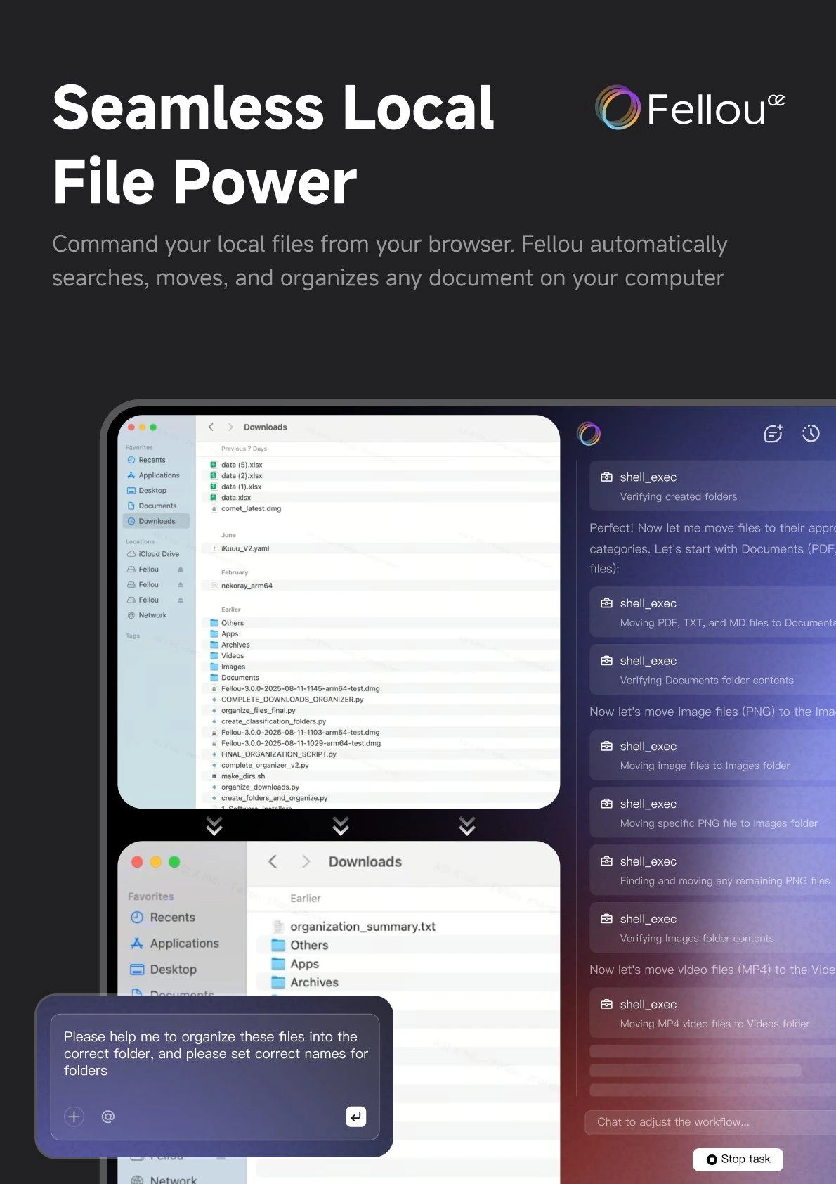
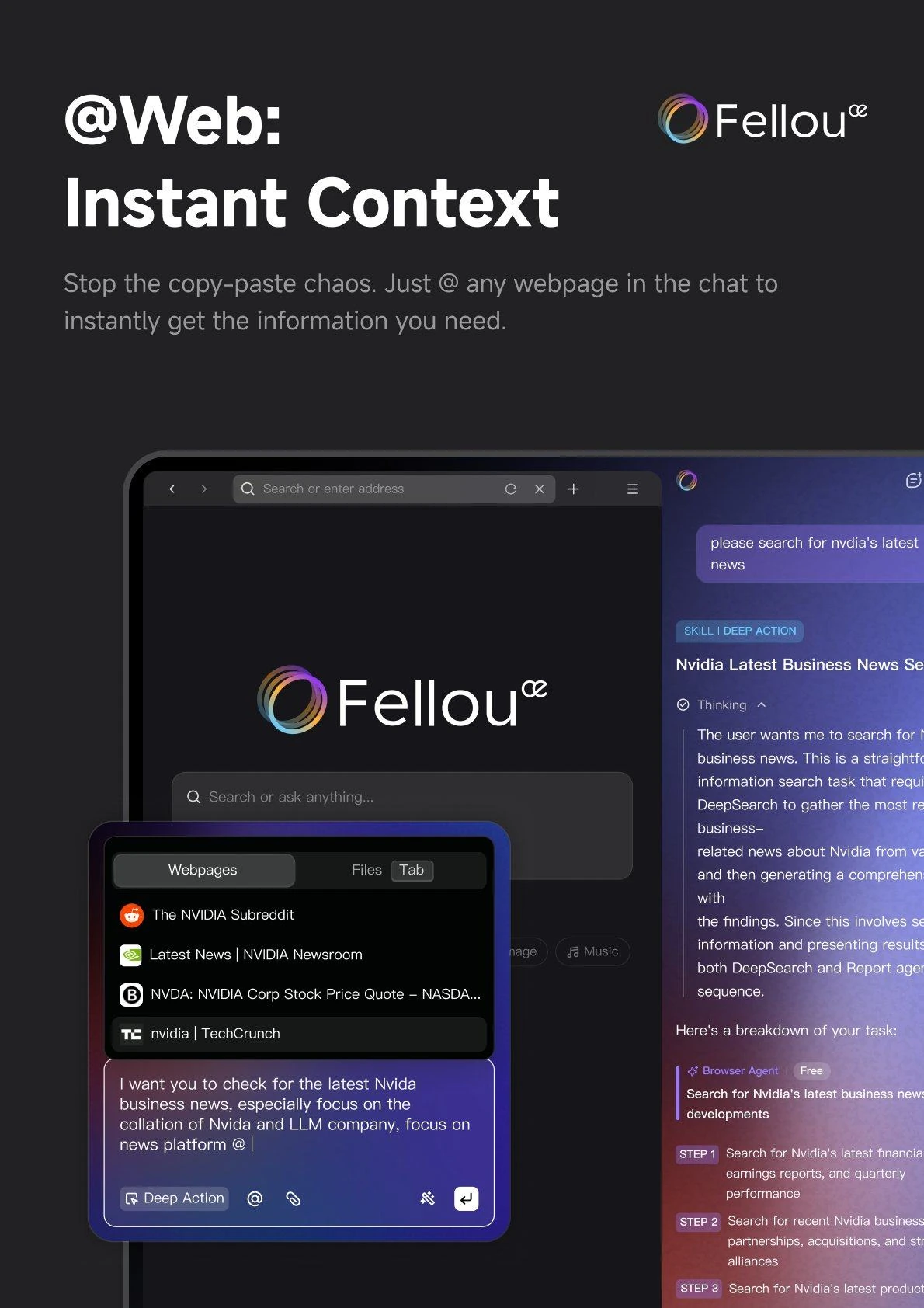
Image references: Four posters use interface details, layered panels and short headlines to explain product features. Together, they show the steps from entering a prompt to completing a workflow and viewing the result.
Copyright © FellouAI. All rights reserved.
Design guidelinesApplications+
One identity, across release, feature and campaign.
Let the content determine the emphasis while the identity, spacing and type hierarchy stay consistent.
Use one version number and one product message. Keep the identity location consistent between releases.
Reuse title position, margins and screenshot treatment so each poster reads as part of one family.
Keep the browser-and-hand gesture legible in a compact circle; review at actual output size.
Suggested behavior & continuity
Series
Keep the headline, logo and supporting text in predictable positions.
Motion
Reveal workflow steps in order; keep labels still long enough to read.
Small screen
Reflow copy and reduce layers before shrinking everything.
Archive
Label dates and version context so historical material stays understandable.
03 / Campaign & merchandise
Inviting people
to take part.
The campaign poster gives the activity, participation steps and rewards a clear hierarchy. A browser-and-hand graphic adapts the identity for merchandise.
The campaign has already ended. Presented here for visual display only.
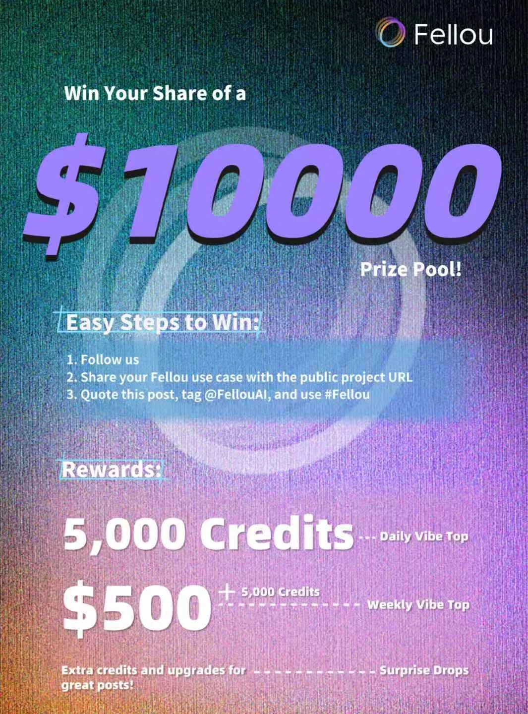
A familiar gesture.
A different format.
The browser window and “OK” hand form a compact graphic that can work across light, dark and gradient badge treatments.
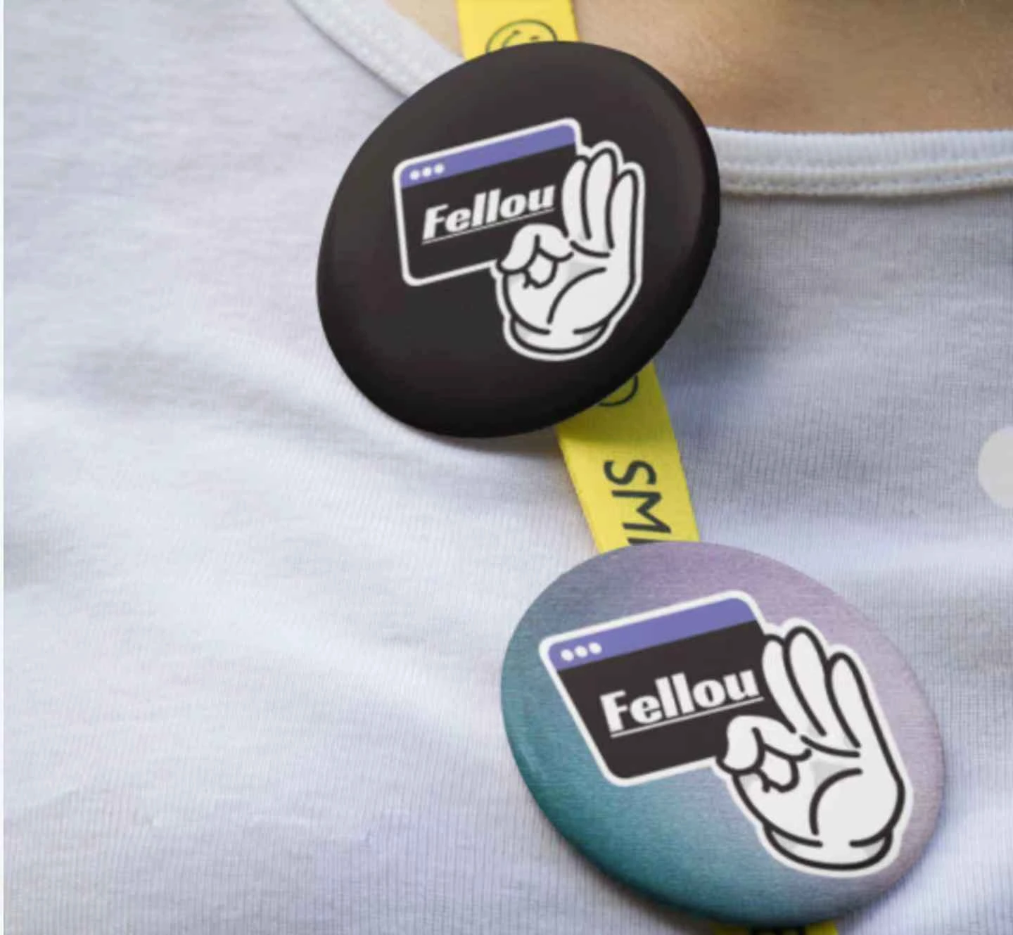
One gesture.
Two expressions.
The badge combines a browser window and an “OK” hand. Two versions explore a black background and a textured blue-violet treatment.
Design guidelinesMaterials & views+
Screen layers and printed objects need different rules.
The product posters use translucent depth; badges use a compact flat composition. Preserve that difference as the work changes medium.
Digital layers
Separate editable text from gradients and screenshots. Keep a quiet reading area; overlap should explain the workflow.
Iridescent graphic
Reuse the original spectral artwork. Keep smooth transitions and inspect banding at delivery size.
Badge production
The current object is a mockup. Confirm substrate, finish, cut line and the visibility of small details with a physical proof.
Surface samples are schematic illustrations of the proposed appearance.
A print layout is more useful than three product views.
For this communication project, front artwork, a cut-line file and a finish sample carry the useful specifications. Three views are only needed if the badge construction itself is being designed.
- Digital poster
- Provide the complete composition and a smaller-screen reading check.
- Badge face
- Keep the browser-and-hand graphic inside the safe area; proof the spectral variant separately.
- Production file
- Separate artwork, cut line and finish notes. Final measurements follow the selected supplier.
Delivery & reuse
A shared system for recurring work.
Communication channels
Delivered brand and marketing materials across four channels in collaboration with the product, marketing and operations teams.
Repeat-format production
Reusable templates reduced the production time for comparable recurring materials from 90 to 30 minutes. This applies to repeat-format assets, not an entire campaign.
04 / Product in motion
From a prompt
to a travel plan.
A product demonstration follows a trip from Los Angeles to San Francisco: entering the request, running Deep Action, and exploring the resulting itinerary, accommodation suggestions and map.
The campaign has already ended. Presented here for visual display only.