Portfolio homepage redesign / 2026
Paper & Water
Paper, light, and a little curiosity. A more tactile way to discover a designer’s work.
Explore the live homepage- Period
- October 2026
- My contribution
- Visual direction · Interaction design · Iteration
- Format
- Portfolio website · Working prototype
The initial brief
Two requirements to begin with.
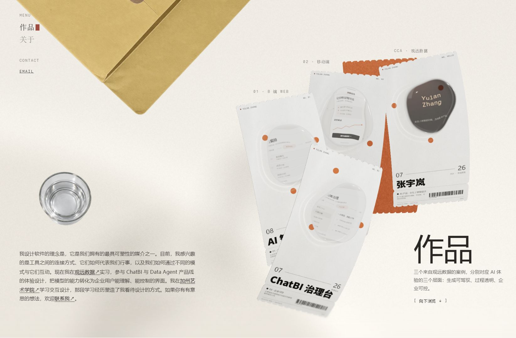
Yulan's initial request had only two requirements: preserve the website's existing style, and place water droplets above the cards.
Within those boundaries, I developed the receipt and ink treatment, composition, accent placement, water appearance and interaction refinements. The original project content, warm visual character and browsing structure provided the foundation.
The design task was to make these choices work together while keeping the project titles readable and navigation clear.
01 / Before & after
From floating cards to a working desk.
The content stays familiar. The hierarchy changes: larger receipts bring the projects forward, while paper, water and the red backing sheet establish a shared material language.
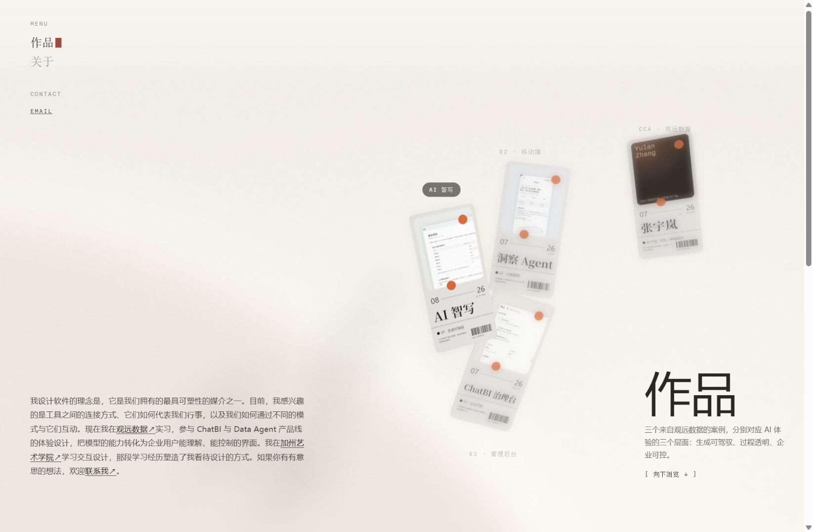
Drag to compare. Use arrow keys when the slider is focused.
Keep
Project content, warm neutral tones, the vertical browsing sequence.
Rework
Card scale, paper silhouette, image treatment and the balance of the scene.
Connect
Hover, water response and a red sheet that becomes the navigation rail.
02 / My contribution
A sequence of design decisions.
Yulan set the two initial requirements. I translated them into material, composition and interaction decisions, then evaluated and refined those decisions in the running prototype.
- 01
Define the material language
I moved the direction from frosted cards toward thin receipt paper, photocopier-like ink and clear water. The existing warm palette and orange-red accents tied these materials together.
- 02
Shape the interaction
I specified a larger, front-facing hover state with the existing wobble retained; droplets follow the pointer’s path only on the first screen. The red sheet continues into the scrolling navigation.
- 03
Edit through iteration
I corrected overly thick paper, rigid water volumes, distant light rings and crowded red-paper placement. Each decision was recorded with its reason and affected files.
03 / Design details
Different materials. One visual world.
The details had to agree on weight, light and scale. A convincing surface should support the project, rather than compete with it.
Early explorations / October 2026
Two ways to frame the work.
Before arriving at the water treatment, I tried both rectangular project images and irregular image windows. These recordings show how each version responds when a card is brought forward.
Rectangular project images
The interface sits within a rectangular image area. On hover, the selected receipt comes forward and the surrounding cards soften, making the change of focus easy to see.
Irregular image windows
The next version places the images inside changing, uneven contours. The receipt and hover response remain, while the image boundary becomes part of the movement.
Cropped excerpts from the working prototypes. Select play to see the motion.
Carried forward
I kept the receipt structure and the enlarged hover state. The irregular outline developed into the clear water form shown above, with further work on its thickness, highlights and printed-paper setting.
My visual approach
The grain of paper. The clarity of water.
I used a tactile desk as the visual setting: rough, printed paper holds the information, while clear, moving water draws attention to the work. Six choices connect the materials, typography and motion.
- A tactile, asymmetric desk
- I arranged the receipts at different heights, with a cropped kraft envelope and glass at the edges. Their scale, perspective and overlap suggest a real desktop, while the open space keeps the projects in focus.
- Receipt paper and photocopier ink
- Fine perforations and a single soft bend give the paper its lightness. Black-grey speckles and uneven ink coverage add a photocopied texture; the main titles stay dark and clear.
- Transparent water and refracted light
- I used irregular water contours, a restrained volume and edge highlights to suggest transparency. The artwork stays inside the drop, with two nearby light rings on the paper responding to its movement under a fixed light direction.
- Warm neutrals with orange-red accents
- Warm white paper, grey-black ink and ochre kraft form the base. Equal-sized orange-red dots sit differently around each drop, and a single red sheet behind the group repeats the accent without crowding the scene.
- Bold titles, quiet receipt details
- Heavy black project names establish the first reading level. Smaller monospaced labels, dates, dividers and barcodes retain the receipt language and give the supporting information a quieter role.
- Organic contours and spring-like motion
- I paired slow water deformation with a larger, front-facing hover state and a soft return. Clear droplets follow the pointer only on the first screen, making the material respond to the visitor's movement.
01 / Paper & ink
Thin paper. Clear type.
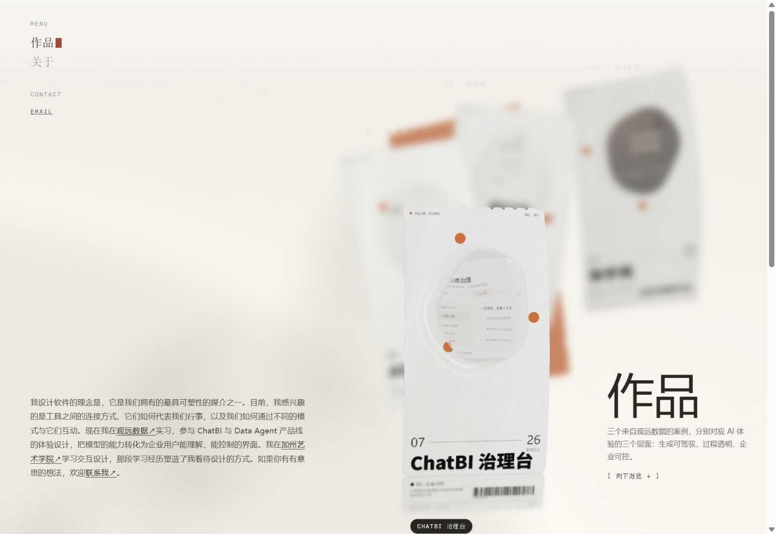
I lengthened the receipt, refined the spacing of its teeth and reduced the bend to one gentle curve. Black-grey grain adds a printed texture, while the title stays dark and legible.
- One curve instead of several competing folds
- Toner grain without sacrificing title contrast
- Dates, barcodes and project labels retained
02 / Water & light
A drop, not a solid disc.
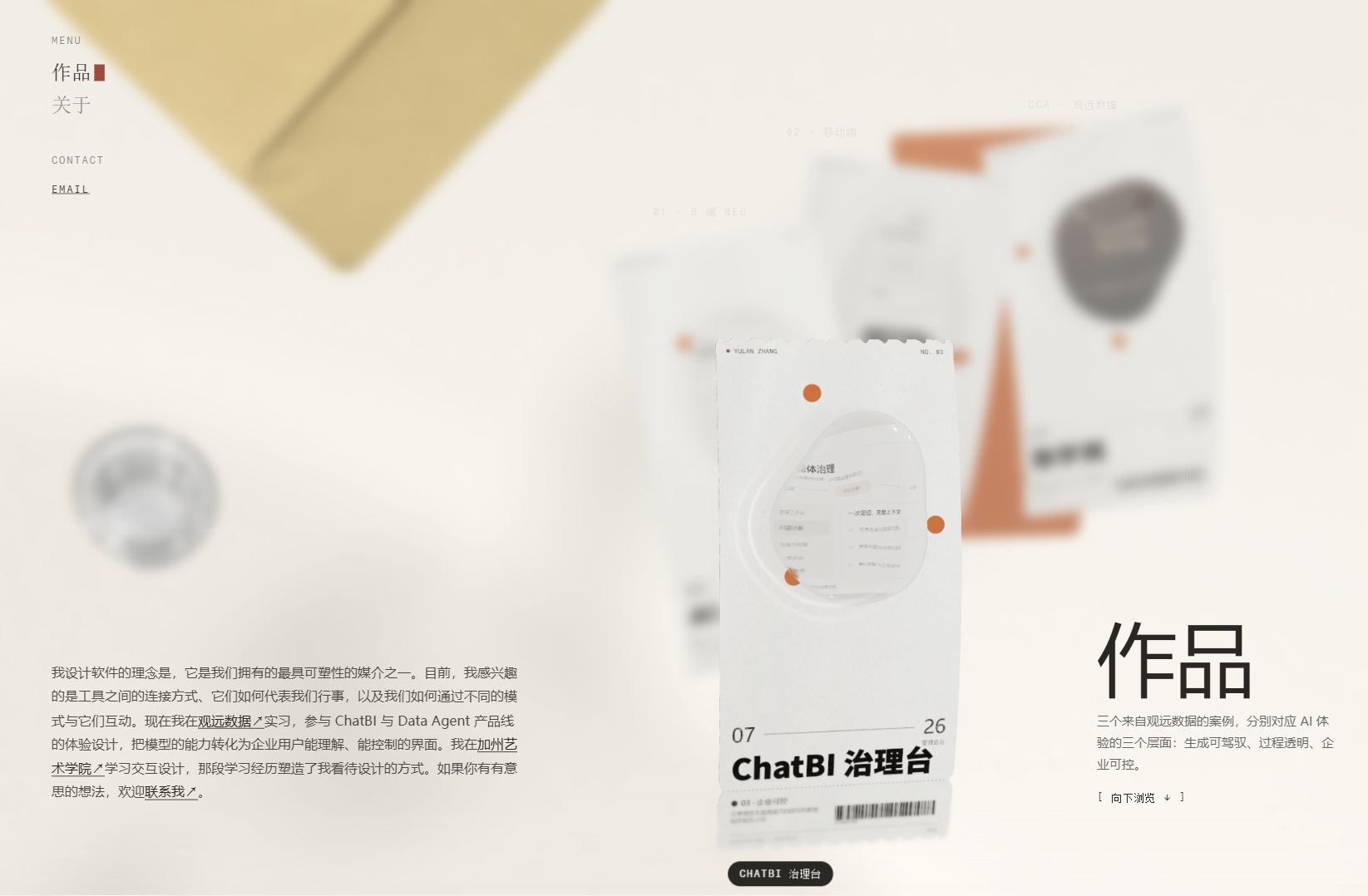
Early volume studies felt too large and rigid. I reduced the height and curvature, kept the content within the water contour, and brought the two light rings closer to the drop.
The contour keeps a visible, slower movement. Light on the paper responds to the moving drop under a fixed light direction.
03 / Composition
Leave room for the work.
Only one red backing sheet sits behind the group. A large, partially cropped kraft envelope points toward the receipts; a smaller glass sits above the introduction on the left.
Scale and spacing establish a desk-like scene while leaving the text and project entries usable.
Design guidelinesColor / Visual elements / Typography+
A shared language for paper and water.
The colors, graphic elements and type hierarchy used in the homepage, brought together as a reusable visual set.
A warm foundation, with one vivid accent.
Light paper and dark ink establish the reading hierarchy. Orange-red connects the dots, backing sheet and scrolling guide; kraft adds warmth at the edge of the scene.
#F8F5EFWarm white / Scene
The quiet desktop field leaves room for shadows, refracted light and the work.
#FAF9F5Paper white / Receipts
A lighter base for the thin receipts, with subtle grain and a soft bend.
#151412Dense ink / Project titles
Keeps the main project names dark and continuous through the print texture.
#797269Warm grey / Supporting details
Used for receipt metadata, fine dividers and supporting print details.
#DF622FOrange-red / Visual accent
A shared color for the equal-sized dots and the single red backing sheet.
#C8AA66Kraft / Material reference
A representative warm yellow for the envelope; its image retains natural variations in tone.
Scene, paper, ink, grey and orange-red values come from the current homepage implementation. Kraft is a material reference swatch. Lighting, transparency and texture affect their appearance in the live scene.
Six elements that make the scene recognisable.
Each element has a role: carrying work, marking a point of attention, or establishing the scale and perspective of the desktop.
Receipt / Information carrier
Long proportions, fine perforations and one soft curve hold the project image, title and receipt details together.
Water / Project window
The artwork remains inside the organic contour. Highlights and two nearby light rings connect the moving water to the paper.
Dots & backing / A repeated accent
Three equal circles use different positions on each card. One red backing sheet sits behind the group and becomes the scrolling guide.
Receipt details / Reading rhythm
Dates, a connecting rule, small labels and barcodes separate the title from supporting information.
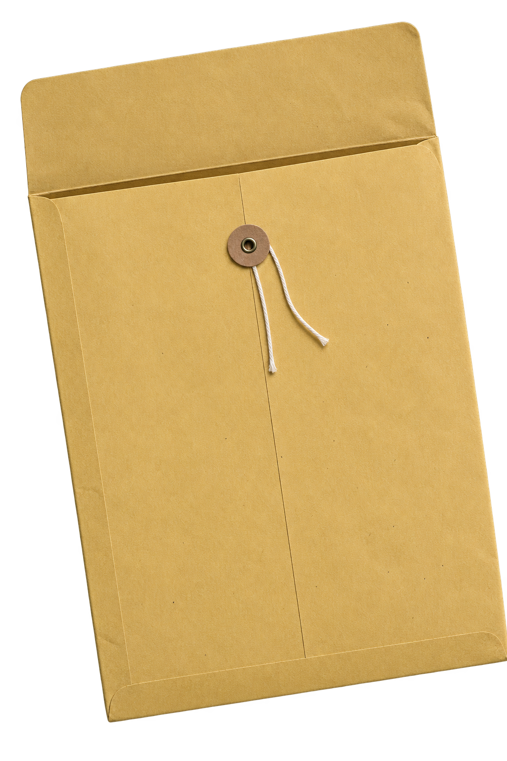
Kraft envelope / Direction
A large, partly cropped envelope opens toward the receipts. Its fold, empty opening and perspective establish the tabletop.
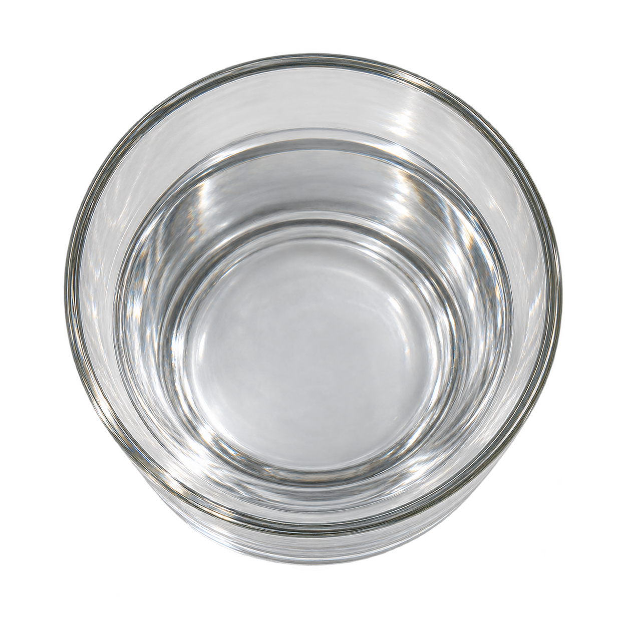
Glass of water / Scale
A smaller glass sits above the introduction at the lower left, echoing the water material and balancing the larger envelope.
The paper and water panels show captured project details; the dot and metadata panels isolate their graphic structure. Envelope and glass images are the assets used in the homepage.
Clear titles, quieter receipt information.
Bold Chinese project names carry the first reading level. Monospaced numbers and labels give the smaller details a printed receipt rhythm.
- Project title
- The scene uses a 900-weight Chinese sans stack: Noto Sans SC, PingFang SC and Microsoft YaHei, with a system fallback. Dense ink keeps the strokes clear.
- Receipt metadata
- Fragment Mono structures the Latin labels and numbers; Chinese labels fall back to the available Chinese system font.
- Print texture
- Small grain sits within the ink. Keep the title strokes continuous and give fine labels enough clear space.
04 / Interaction & motion
Every action has a visible response.
I retained the original entry, browsing, focus and ticket-tearing flow. My refinements concentrate on hover clarity, water response, pointer droplets and the transition from red paper to navigation.
- 01 / Arrive
A staggered, gentle arrival.
On entering the homepage
The receipts appear one after another, settling from slightly above and a smaller scale. Their staggered vertical composition remains, with restrained floating movement and slow water deformation.
- 02 / Hover & release
Bring the chosen card forward.
Move onto a card, then move away
The card enlarges and faces the viewer while keeping its pointer-driven tilt and gentle displacement. The paper bend relaxes slightly and surrounding cards soften. On leaving, a damped return restores the resting pose.
- 03 / Water & light
Water moves with a little delay.
As the card tilts and settles
The water has visible, slow contour changes and a slight inertial lag and rebound. Its center stays anchored, and the artwork moves inside the same outline. Under a fixed light direction, highlights and two nearby light rings respond together.
- 04 / Pointer trail
Draw a few clear beads from the edge.
Touch the visible water with the pointer and leave its edge
A larger bead emerges slowly, followed by smaller beads along the actual pointer path. They stretch in the travel direction, round off after separating and gradually fade. A still pointer produces no more beads; the effect is limited to the first screen.
- 05 / Scroll transition
The backing sheet becomes a guide.
Scroll down or choose a receipt on the first screen
The scattered receipts move into the work sequence. The single red sheet narrows, straightens and moves to the left navigation rail; the introductory text, envelope and glass fade away as browsing controls appear. Returning upward restores the first-screen composition.
- 06 / Browse
Keep position clear while moving.
Scroll, use arrow keys, or select a navigation point
The sequence eases between projects while the active point, title and supporting copy update. Touch gestures move the sequence and settle near the closest project; sliding along the point list offers direct navigation.
- 07 / Focus & return
Give one project the full stage.
Click a card in the work sequence or press Enter
The chosen card moves forward and faces the viewer, while the other cards recede. Its description and case entry appear nearby. Clicking the background, using the return control or pressing Esc leaves this focused state.
- 08 / Open a case
Let the receipt finish the transition.
Activate the focused card or its case entry
The existing ticket-tearing gesture opens from the right: the stub curls, drops and fades before the original site opens the case. This embedded demonstration retains the gesture and stays within the homepage preview.
Motion that leaves room to read.
Lower amplitude and slower water movement keep the scene calm. Pointer beads stop and clear when entering the work sequence; returning to the first screen requires touching the water again. These effects approximate material behavior visually.
Touch and reduced motion.
Touch users can browse and focus without mouse-only tilt or bead trails. The reduced-motion preference suppresses decorative movement and skips the ticket-tearing animation. If the 3D scene is unavailable, the original homepage exposes a readable work list.
Controls for this case study.
The live preview has explicit enter, exit, pause, resume and restart controls; Esc returns to the case study. It pauses when outside the viewport. Before-and-after comparison and the three state tabs below support keyboard input.
Consistency inside the project pages.
I also aligned the Insight Agent copy with the other cases and matched the AI report snapshot text to its motion: a 0.6-second fade and upward movement on tab changes, without replaying when the current tab is selected again.
Three moments in the sequence
Try the live motion ↑A group to discover.
The receipts remain vertically staggered. The composition establishes the material story before asking the visitor to choose a project.
Bring one work forward.
The hovered card enlarges and faces the viewer, retaining its wobble. When the pointer leaves the water, a large bead emerges first, followed by smaller clear droplets along the path. This effect stays on the homepage.
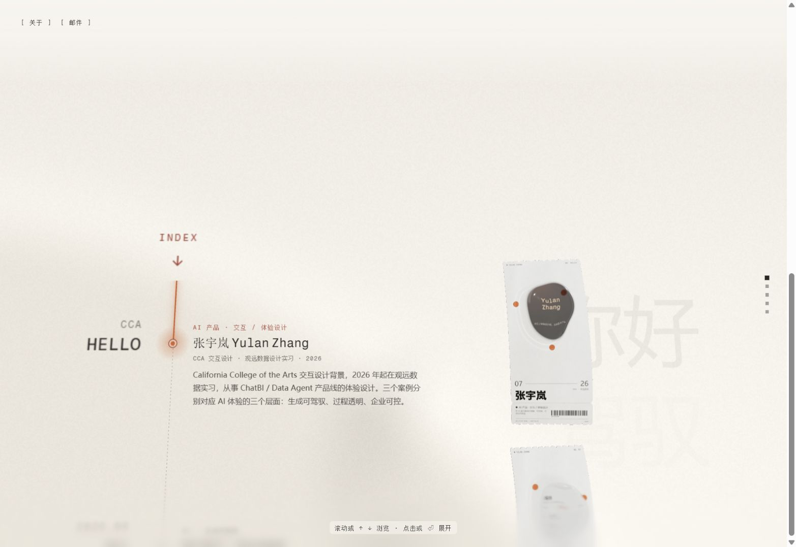
Let the accent become a guide.
The red sheet narrows into the left navigation rail as the scattered receipts return to the work sequence. The decorative layer becomes an orientation cue. This capture documents the scrolling iteration.
05 / Reflection
The work was in the refinements.
The most useful changes were often reductions: less thickness, fewer light rings, a quieter wave, and more space around the text.
Recorded iterations
A traceable record of visual and interaction decisions.
A working direction, ready for review.
The implementation and 75 change notes were delivered together on a GitHub branch. Desktop and mobile layouts were reviewed locally. Formal usability testing and performance evaluation remain next steps.
View the implementation & change log ↗06 / References
Where the visual ideas began.
I drew on five references for paper, ink, organic contours and responsive motion. Each informed a specific part of the final design.
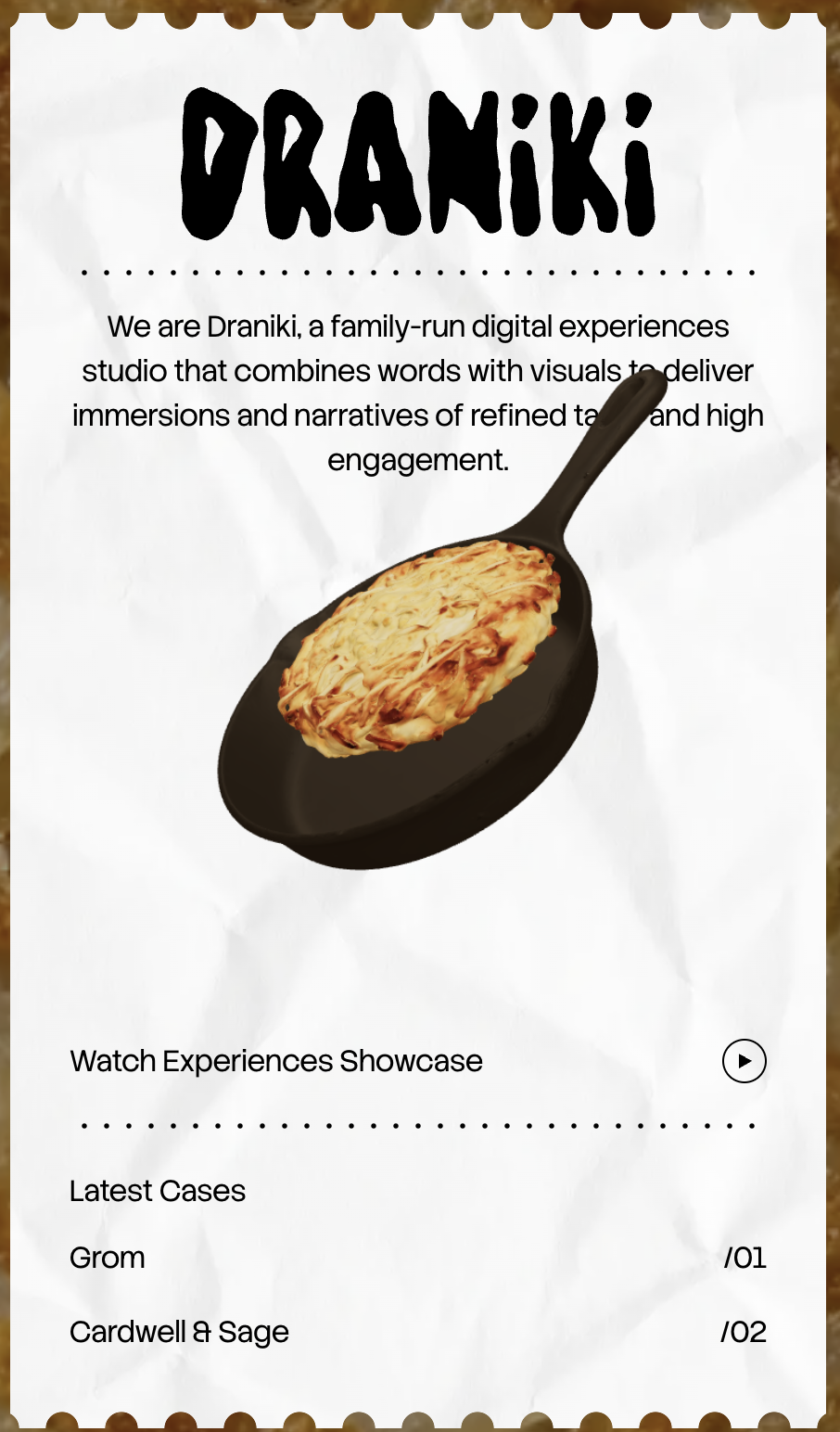
01 / Paper & object
Draniki
Source: Draniki website · Screenshot collected during the design process
I took the receipt-like silhouette, perforated edges and the contrast between paper and a floating object. These became longer project receipts with a single gentle bend and a water-shaped image above them.
Visit Draniki ↗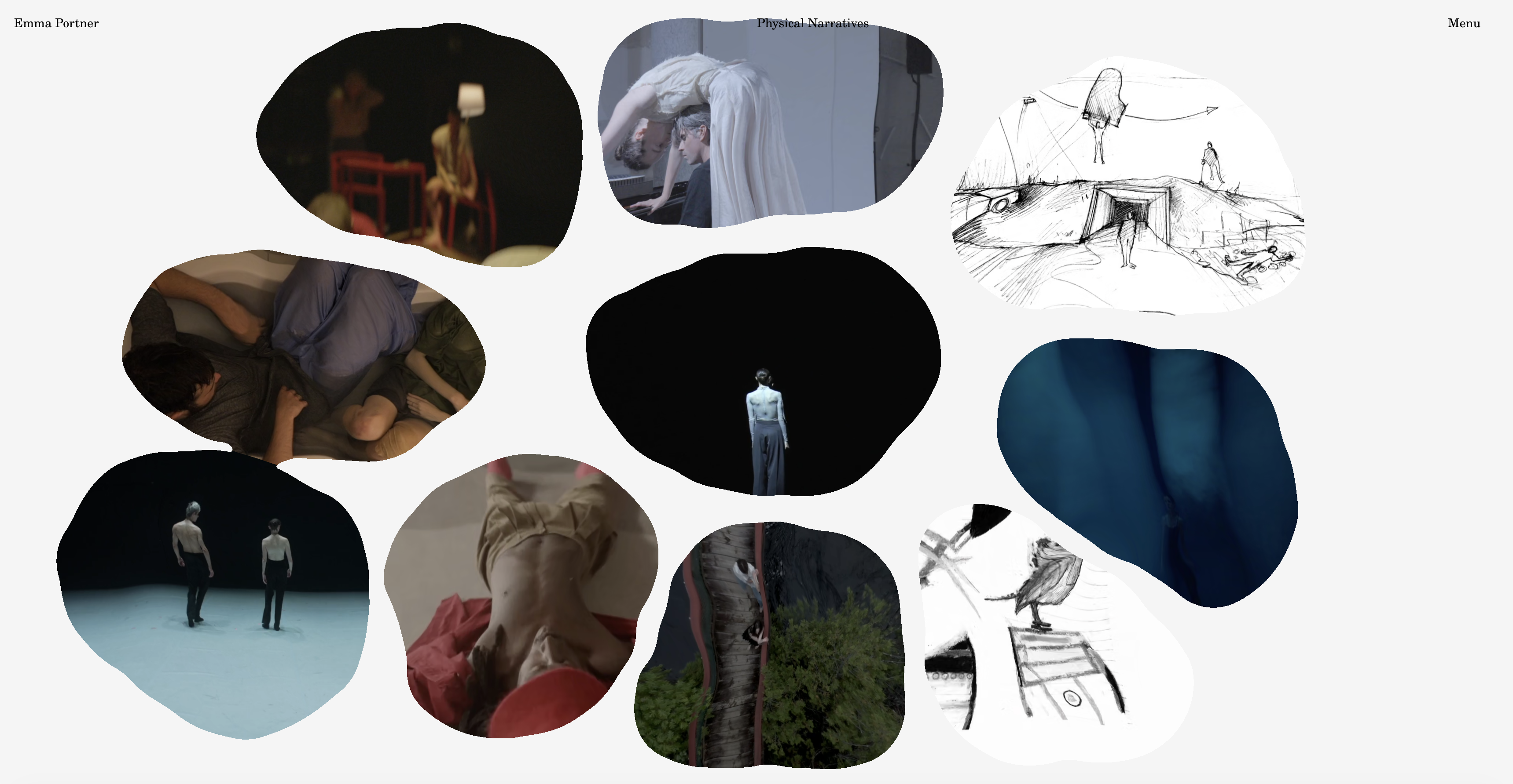
02 / Contour & motion
Emma Portner
Source: Emma Portner website · Work view
The irregular image outlines and gentle wobble informed the project windows. I carried that organic rhythm into the water contours, then adjusted their amplitude and pace around the receipt composition.
Visit Emma Portner ↗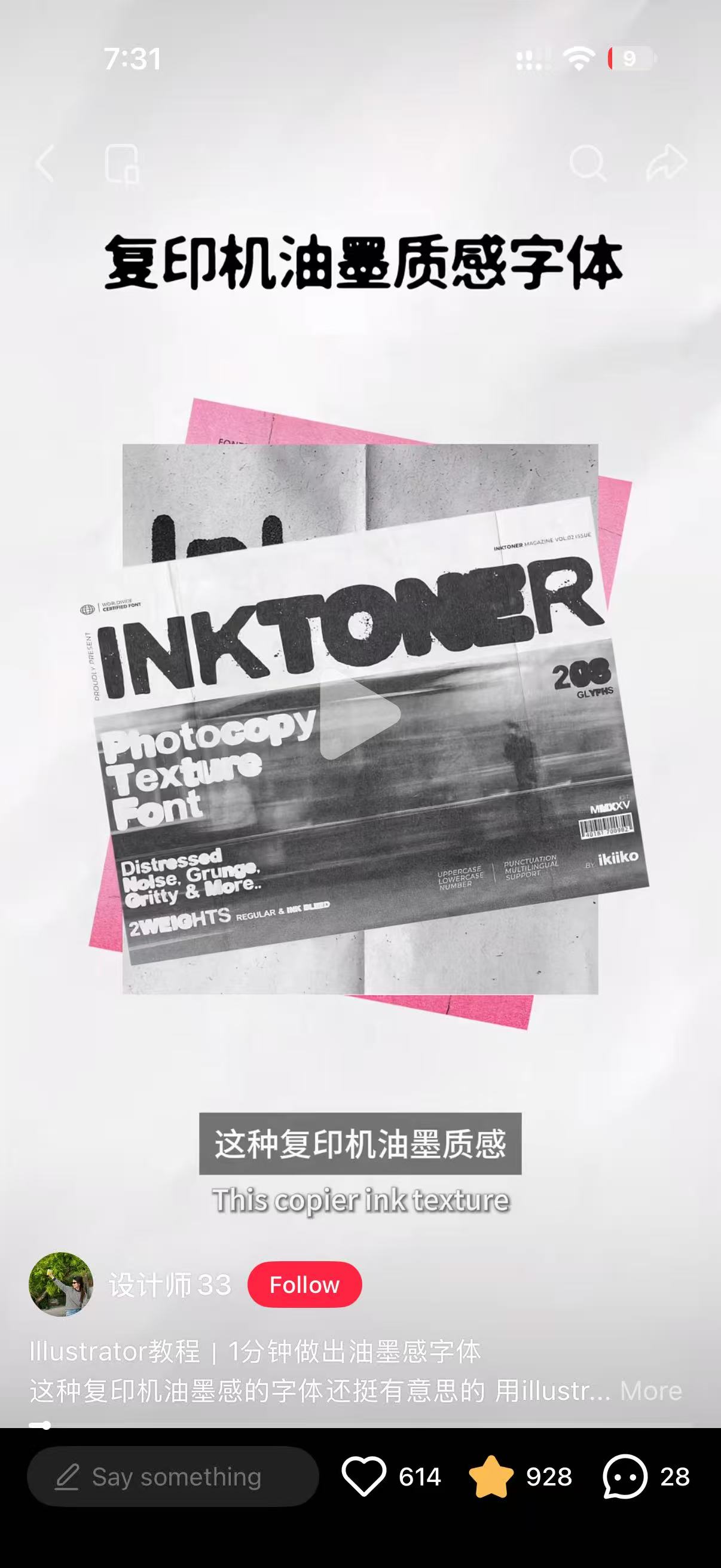
03 / Ink & type
Photocopier ink
Source: screenshot shared by 设计师33 · INKTONER specimen shown in the image
I used the dense black lettering, small gaps in the ink and black-grey speckles to guide the print treatment. The receipt uses bold Chinese type with custom grain, keeping the project names clear.
View the supplied screenshot ↗04 / Hover response
Comet Card · Aceternity UI
The pointer-driven tilt and soft return informed the card response. I combined that movement with a larger, front-facing hover state so visitors can focus on one project.
Open the motion reference ↗05 / Water & light
Water sphere study
Source: a Xiaohongshu video shared during the design process
The video's clear volume, ripples and moving reflections informed the water material. After trying a blue glow, I kept neutral highlights and two nearby light rings to fit the warm paper scene.
Open the shared video ↗Reference images remain credited to their original creators. Select a thumbnail to view the full screenshot used during the design process.