Speculative interaction design
NExO
Sensing the invisible. Making social environments easier to understand.
Discover the project- Project
- FigBuild 2026 · Team concept
- My contribution
- Research, concept development & prototyping
- Status
- Competition prototype · Proposed sensing functions
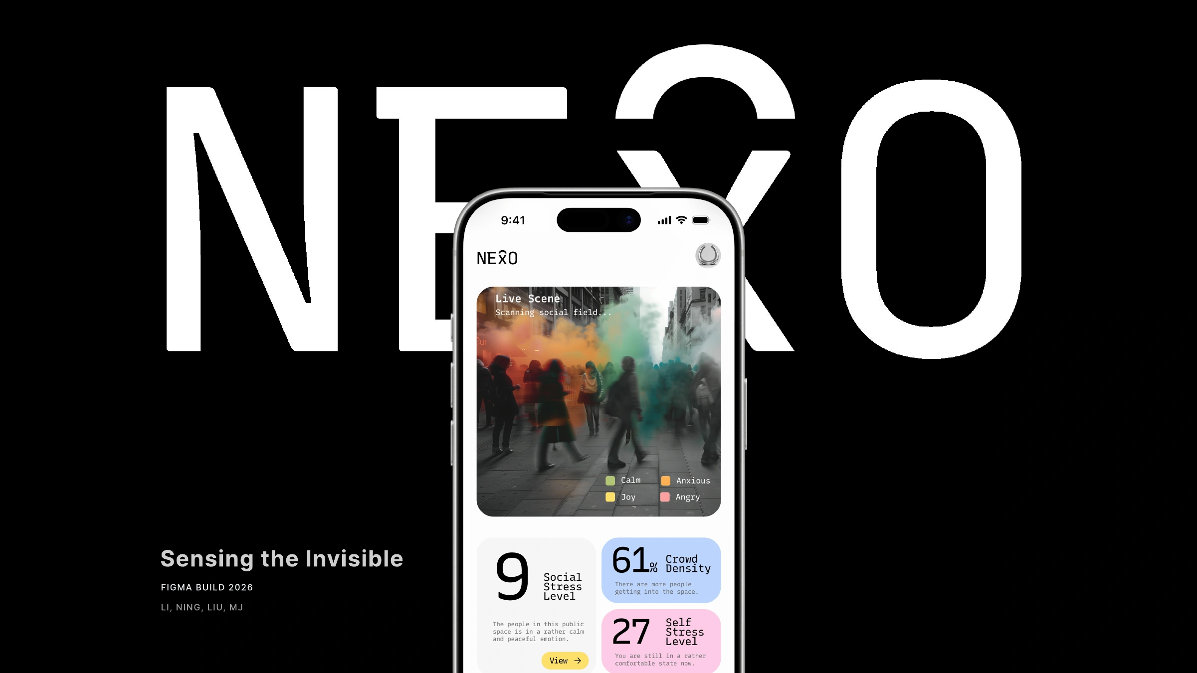
The project
Project overview.
NExO is a wearable and app concept developed by a team for FigBuild 2026. It explores how bodily and environmental signals could be visualized to help people reflect on social situations, through product form, interface design and a concept film.
- Project type
- FigBuild 2026 · Team concept
- Focus
- Wearable + mobile experience
Information visualization
Visual identity & prototyping
My contribution
From concept
to experience.
I contributed to research, problem framing, concept development, and low- and high-fidelity prototypes. I also worked on color and logo studies, graphic assets, the physical wearable prototype and the project film.
- Made with
- Ningxuan Liu, Liyun Xue & Mj Byun
- Tools
- Figma & Figma Make
01 / The starting point
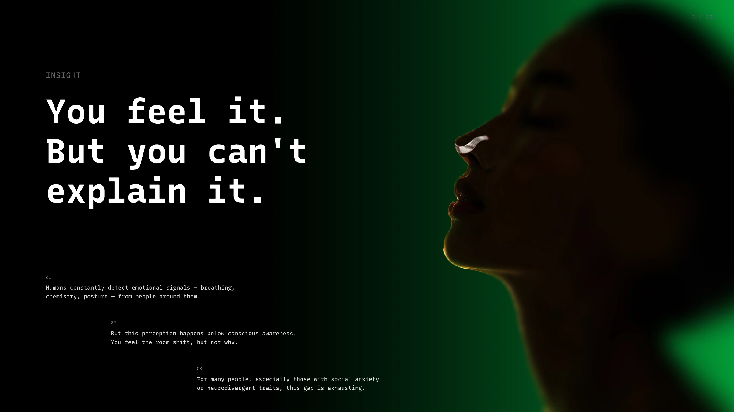
Feeling uncomfortable,
without knowing why.
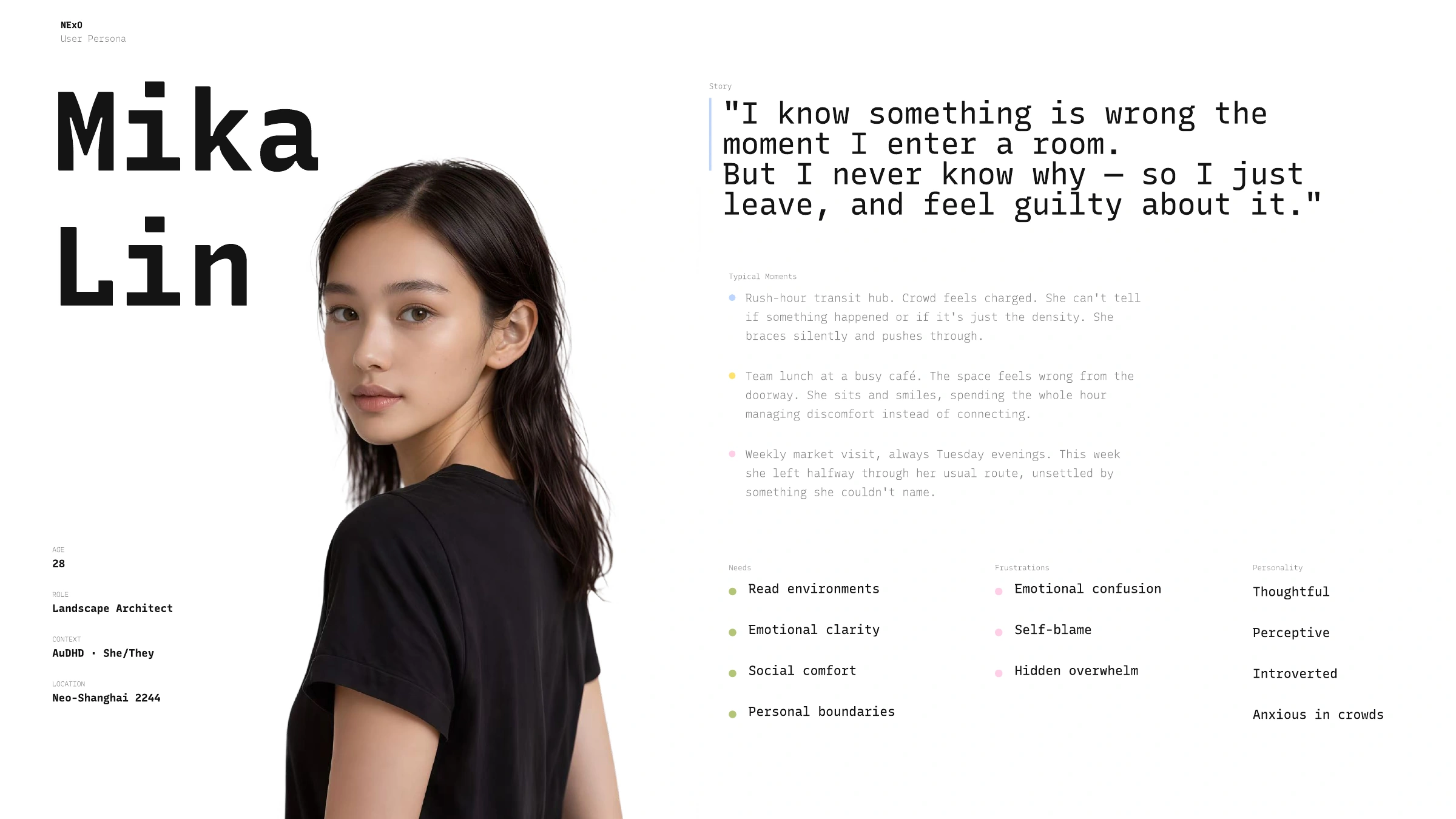
The competition brief focused on sensory experience. We chose a familiar social situation: noticing discomfort without knowing what is causing it.
A speculative scenario
We used a fictional persona, Mika Lin, to explore social comfort and personal boundaries. A future setting let us consider sensing and interpretation capabilities beyond today’s technology.
02 / The concept
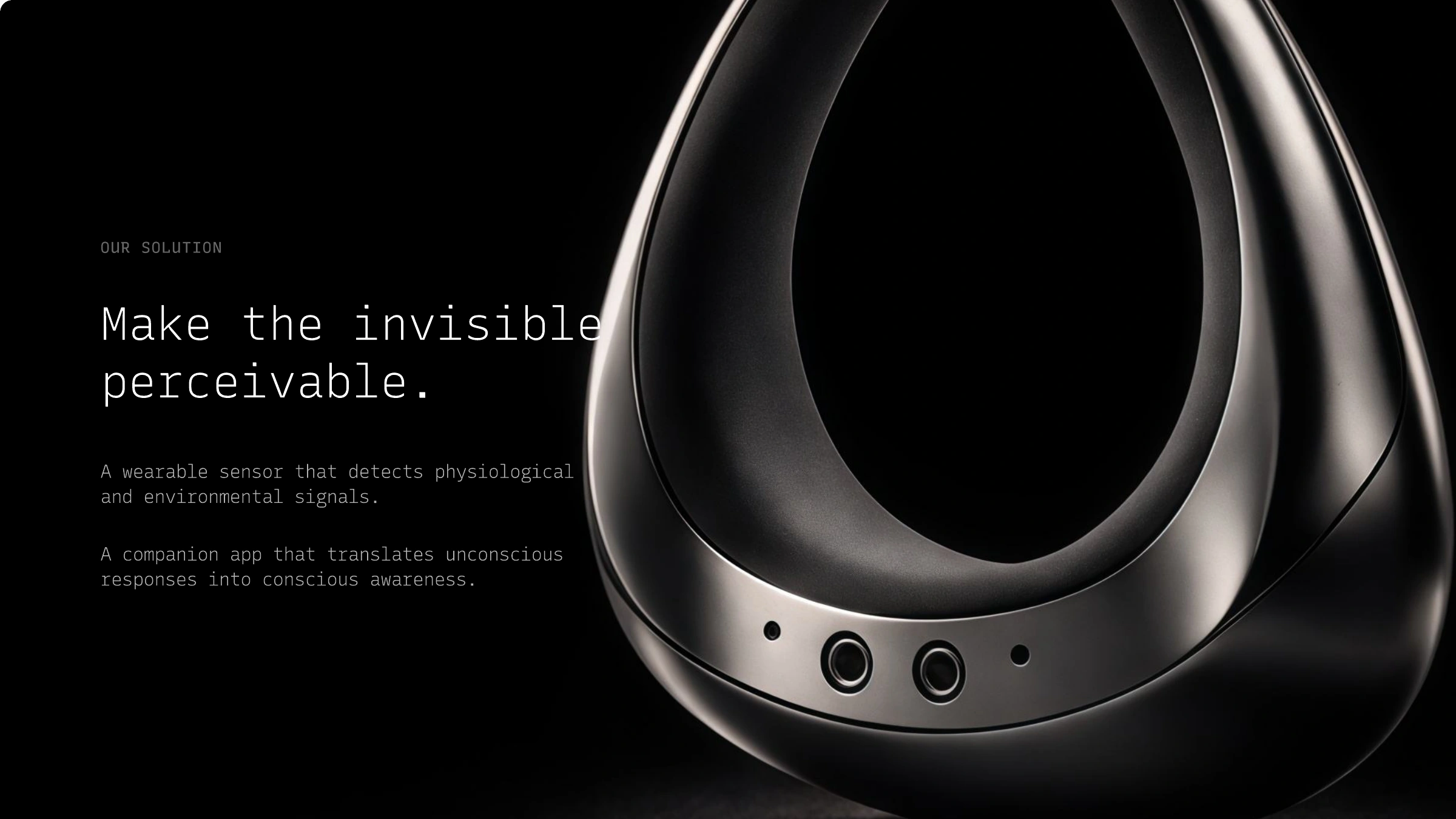
A discreet wearable.
An app for reviewing signals.
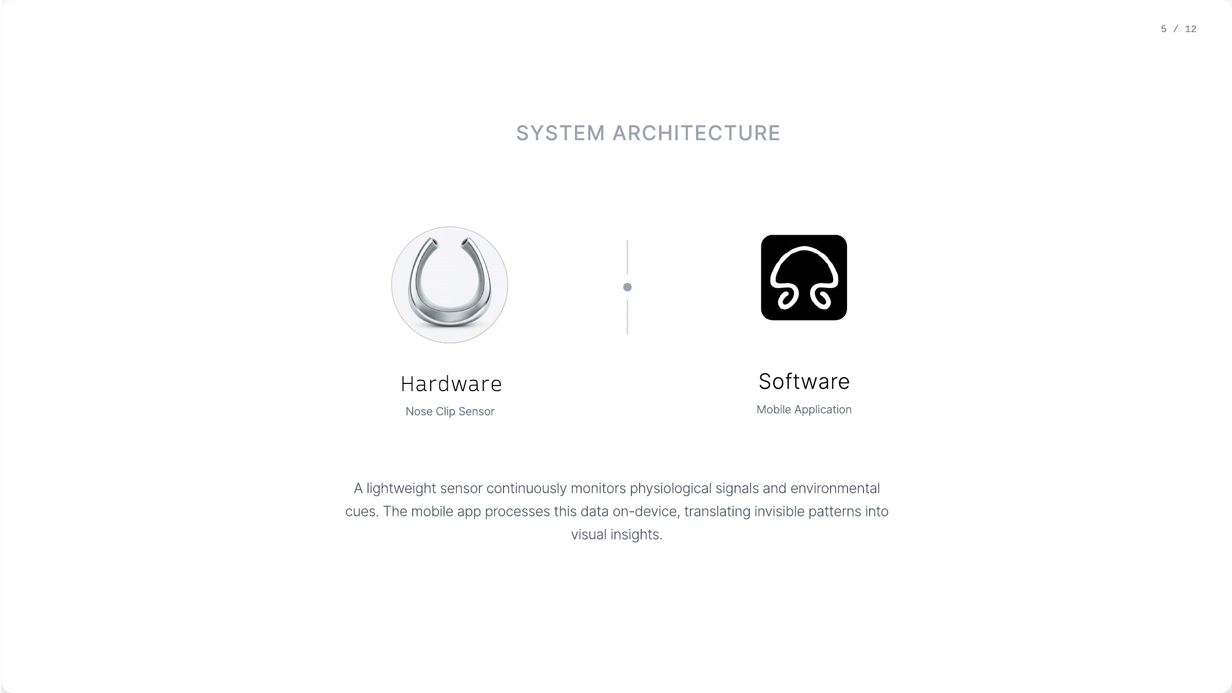
The concept pairs a device worn on the bridge of the nose with a companion app. The proposed system presents bodily and environmental signals as visual cues that the wearer can review alongside the surrounding context.
The core flow
How the proposed system works.
- 01
Detect
The concept begins with bodily and environmental signals.
- 02
Process
Proposed on-device interpretation turns signals into patterns.
- 03
Visualize
The app brings those patterns into a glanceable visual scene.
- 04
Act
The person decides how to respond to their surroundings.
03 / Visual language
One identity,
across object and screen.
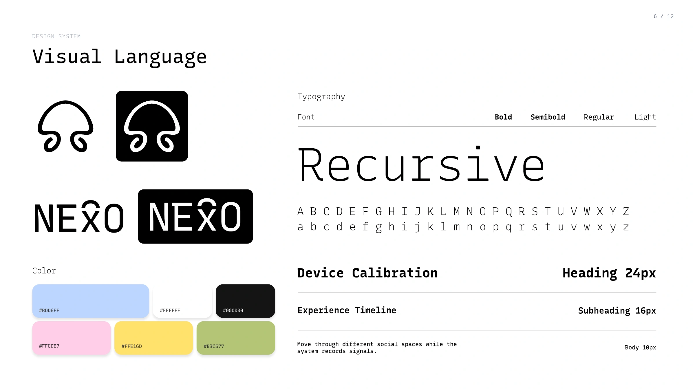
A restrained black-and-white foundation is paired with soft blue, pink, yellow and green. Recursive typography, compact data groupings and a symbol drawn from the wearable's form connect the physical concept to its digital interface.
Design guidelinesColor / Typography / Identity / Materials & views / Use & avoid / Applications+
A quiet object. A legible signal.
The original palette, Recursive typography and nose-clip symbol form the foundation. The following specifications extend that language across the wearable, its companion app and project communication.
Source & extension
Colors, type weights and identity artwork come from the submitted deck. Layout values and usage rules below are proposed extension guidelines; original prototype screens remain the project reference.
Black and white hold the structure. Color gives context.
A neutral base connects the discreet wearable with a data-rich interface. Four lighter accents help separate information without making the whole screen feel urgent.

Structure / Black
#000000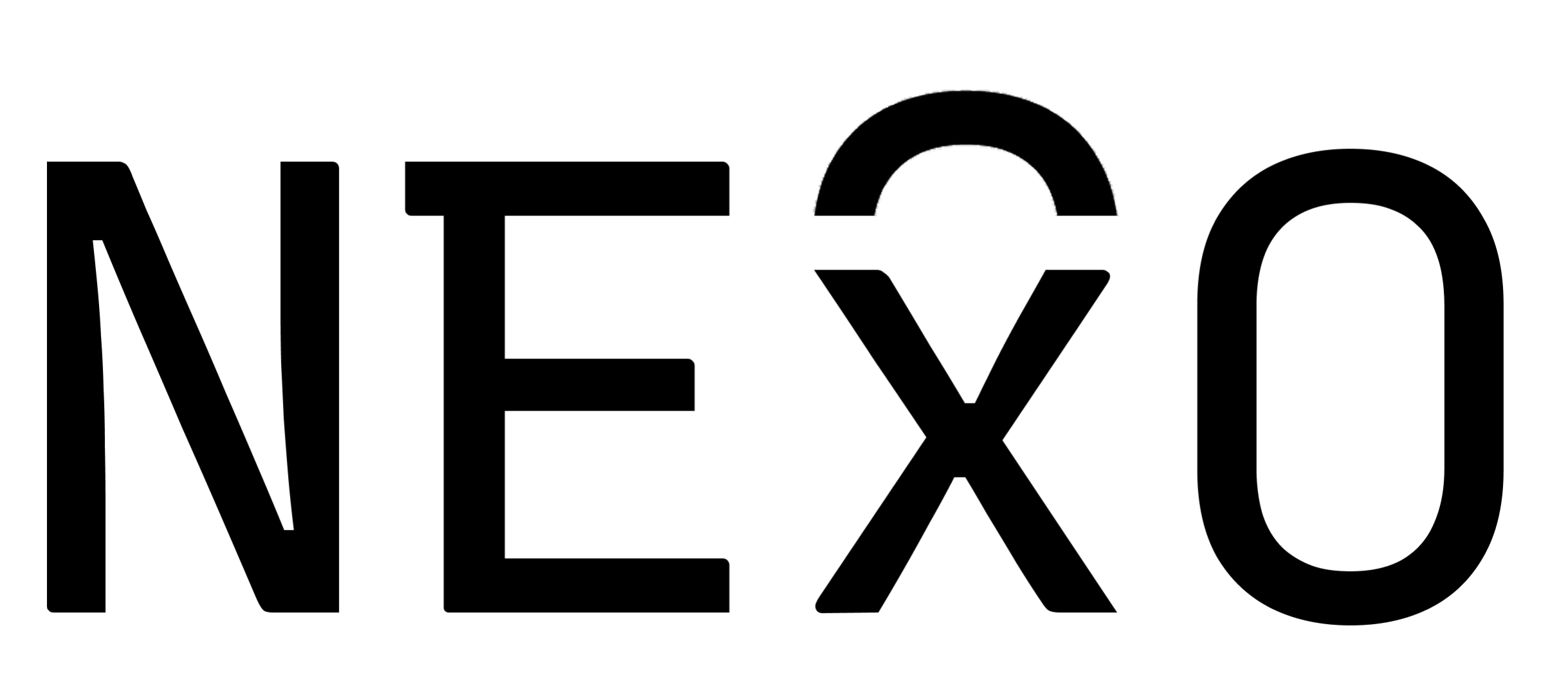
Reading space / White
#FFFFFFUse black for the mark, text and navigation; white for reading surfaces. Keep the logo monochrome so its silhouette stays recognisable beside colored data cards.
Mist blue / Environment
Used for crowd information and guidance in the prototype. Its cooler tone gives external context a clear place in the interface.
Soft pink / Personal
Used for personal readings and calibration accents. A warmer counterpart to blue helps distinguish the wearer from their surroundings.
Signal yellow / Attention
A small, bright accent for a next step, selected detail or confirmation. Reserve it for moments that benefit from attention.
Olive green / Reflection
Appears in the calm legend and the final calibration step. It provides a quieter endpoint in the visual sequence.
These are design associations within NExO. The prototype also has a scene legend for Calm, Anxious, Joy and Angry; keep that legend visible rather than treating interface accent colors as a universal emotion scale.
Dark text on every pastel.
Keep small labels black on the four accent colors. White labels have too little contrast on these light surfaces. Use a word, icon or number together with color.
14.23:115.14:116.24:111.17:1Ratios above compare #000000 with each original swatch. They exceed 4.5:1 for normal text; this checks these pairs, not every image or historical prototype screen.
Recursive, with a deliberate rhythm.
Retain the original monospaced character. Even letter widths support aligned readings and timelines; open forms and measured spacing keep the technical tone approachable.
09:41 · Live scene · 06–14
Original deck: Heading 24 px, Subheading 16 px and Body 10 px, with Light, Regular, Semibold and Bold. Keep this as the source record. The scale below is a suggested mobile application update, measured in CSS pixels.
| Role | Size / line | Weight | Application |
|---|---|---|---|
| Screen heading | 24 / 32 | 700 | Device Calibration, Memory Record |
| Section heading | 16 / 24 | 600 | Experience Timeline and grouped settings |
| Reading copy | 14–16 / 22–26 | 400 | Context, explanations and prompts |
| Supporting label | 12 / 18 | 400 | Timestamps and secondary metadata |
| Key reading | 32–48 / 36–52 | 400–600 | One key reading per card, always with a label |
| Display only | 40+ / 1.15 | 300 | Large editorial specimens, not small instructions |
A stable font setting
For the examples here, use Recursive Mono Linear: MONO 1, CASL 0, upright. Change weight between roles, rather than changing the letterform style from card to card.
Alignment & language
Left-align reading copy, align comparable numbers and keep their units close. Do not stretch letters or use synthetic bold. Chinese uses the system sans-serif fallback; the NExO wordmark remains supplied artwork.
A silhouette shared by object and icon.
The arch and two returning curves recall the wearable. The wordmark has its own custom detail above the x; preserve that artwork instead of typing a replacement logo.

- Master artwork
- Scale the supplied mark uniformly. Keep the opening, returning curves and line weight intact.
- Clear space
- For a standalone symbol, reserve 0.25 of its width on every side; use one capital-letter height around the wordmark.
- Minimum screen size
- Start at 32 px for the symbol and 96 px wide for the wordmark. Inspect the curves and x detail at actual size.
- App tile
- Keep a centred white symbol on a black tile. Reserve internal breathing room and let the platform apply its outer icon mask.
These size and spacing values are extension rules, not dimensions published in the original deck. The examples reuse the original mark without redrawing it.
A subdued finish, close to the body.
The concept render combines a dark body, a metallic face and recessed openings. Describe these visible qualities first, then separate the physical finish from the app surface.
01 / Dark body
Use a broad, soft highlight to describe the continuous curved surface. Avoid grain, glitter and wet-looking reflections.
02 / Metallic face
A restrained directional reflection distinguishes the front band from the body. Keep the openings legible rather than adding a decorative glow.
03 / Digital surface
Use clean white and flat pastel cards, with text and icons on separate editable layers. Keep photographic atmosphere in the scene panel.
The render establishes an appearance direction, not a manufacturing specification. Substrate, skin-contact material, coating, weight and tolerances require a physical prototype before they can be stated as product facts.
Three views: useful at the next hardware stage.
For this wearable, front, side and bottom views would explain different things. The current material provides perspective renders, so it should not be relabelled as an orthographic drawing.
| View | What it should explain | Evidence needed |
|---|---|---|
| Front | Arch silhouette, symmetry and the front aperture arrangement. | A front orthographic export from the product model. |
| Side | Thickness, curvature and the relationship to the nose bridge. | A side section or orthographic view, checked on a physical mock-up. |
| Bottom / contact side | Contact surfaces, clearance and opening locations. | A verified contact-side model with dimensions added after fit testing. |
Keep the silhouette. Keep the information clear.
The identity should remain quiet and consistent. These examples show what to preserve when the design moves into a different size, surface or presentation.
Use / Original artwork
Use the monochrome master and preserve its proportions.
Avoid / Stretched mark
Do not compress the arch or change the returning curves.
Use / Color with a label
Keep the subject and unit beside a reading. Color alone cannot explain it.
Avoid / White on pastel
Do not use white small text on the four pastel colors.
Calibration
Use / A consistent type family
Use Recursive with a clear title, body and label hierarchy.
Avoid / Retyped wordmark
Do not replace the custom x detail with ordinary typed text, an outline or a glow.
One reading at a time, with room to respond.
Carry the same visual rules through the live scene, memory records and personal calibration. Context remains visible and the wearer decides what to do next.
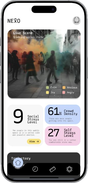
Live scene
Give the scene a clear boundary. Keep personal and crowd readings in separate cards, with labels and units visible.
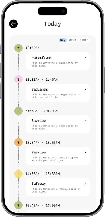
Memory record
Keep day, week and month navigation in the same position. Align times and locations so records can be compared.
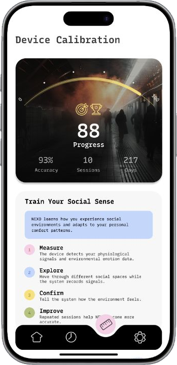
Personal calibration
Number each step, pair color with its label and make the current step visible without changing the whole screen.
Layout extension / a 4 px rhythm
Suggested mobile base: 16–20 px page margins, 12–16 px card padding and 12 px between cards. Use 16–24 px corners for major panels and a touch area of at least 44 × 44 px for key actions. Values are extension targets, not measurements from screenshot pixels.
Motion / a quiet change of state
Use a short opacity transition for a state change; 160–240 ms is a starting range. Keep readings in place, avoid pulsing alerts and provide a reduced-motion version. Do not animate the background continuously.
Define the states around the data.
Examples below define future interface behavior. They are specifications, not live sensor readings.
Updating
Keep the previous reading and its timestamp visible.
No record yet
Explain what will appear here and how to begin.
Device disconnected
Offer a reconnect action without a flashing warning.
Sensing paused
Make pausing and resuming explicit and user-controlled.
The app references above use a light interface; the portfolio also has a dark reading theme. A future dark app would need its own surface and chart contrast rules rather than inverting every color.
A consistent identity, with a clear scope.
NExO remains a speculative design concept. Signal interpretation and feedback describe the proposed experience; copy should invite the wearer to review context rather than claim certainty about another person.
View the original design deck ↗04 / The experience
Notice now.
Reflect over time.
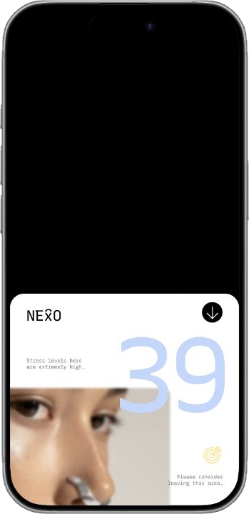
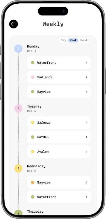
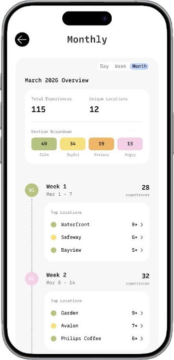
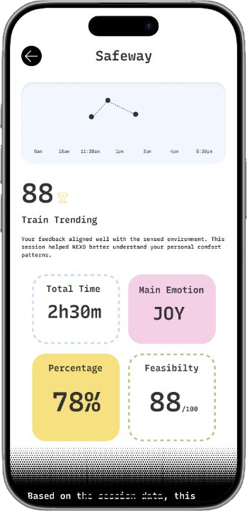
The prototype offers a current-environment view and records of past experiences. Users can review a scene, browse summaries and adjust personal calibration settings.
06–07 / In the moment
A live scene.
Atmosphere, personal metrics and crowd context come together in a compact overview.
08–11 / Over time
Records over time.
Day, week and month views organize past records for review and comparison.
12–14 / Make it personal
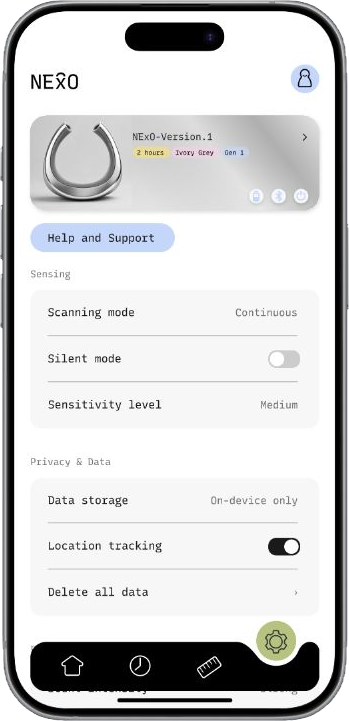
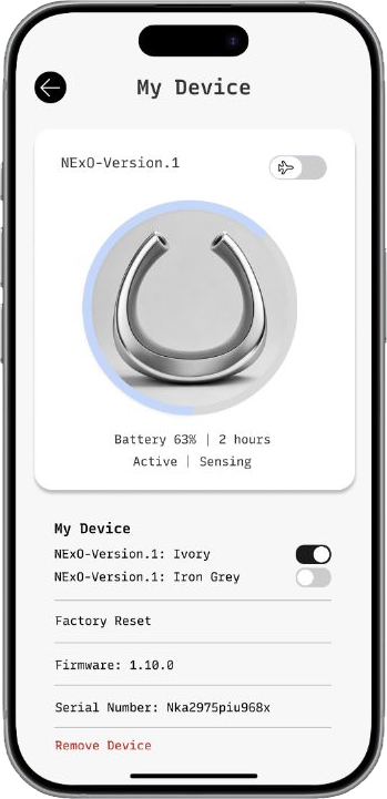
Personal settings.
Calibration, sensing preferences and device settings let the wearer adjust the proposed experience.
05 / Project film
Portfolio cut 01:27NExO
Concept film.
The film introduces the wearable, its companion interface and a possible use scenario.
Continue exploring
NExO is a team concept for FigBuild 2026. The project explores an interaction direction; its sensing, emotional interpretation and feedback capabilities are proposals rather than validated product functions.