Family communication & digital wellbeing
Mood Tracker
Make space for a feeling. Start a conversation.
Discover the project- Project
- Academic concept · Portfolio refinement
- Deliverables
- Phone & watch interaction prototypes
- Validation
- Revised flows not yet tested with users
The project
Project overview.
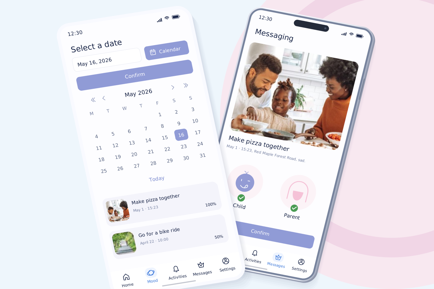
Mood Tracker is a mobile app concept for communication between children and parents. Children can record feelings and choose what to share; both people can respond, suggest activities and agree on plans together.
- Project type
- Academic project · Mobile UI & interaction concept
- Focus
- Child & parent journeys
Interaction design
Mobile interface
01 / A reason to listen
“You don’t
understand me.”
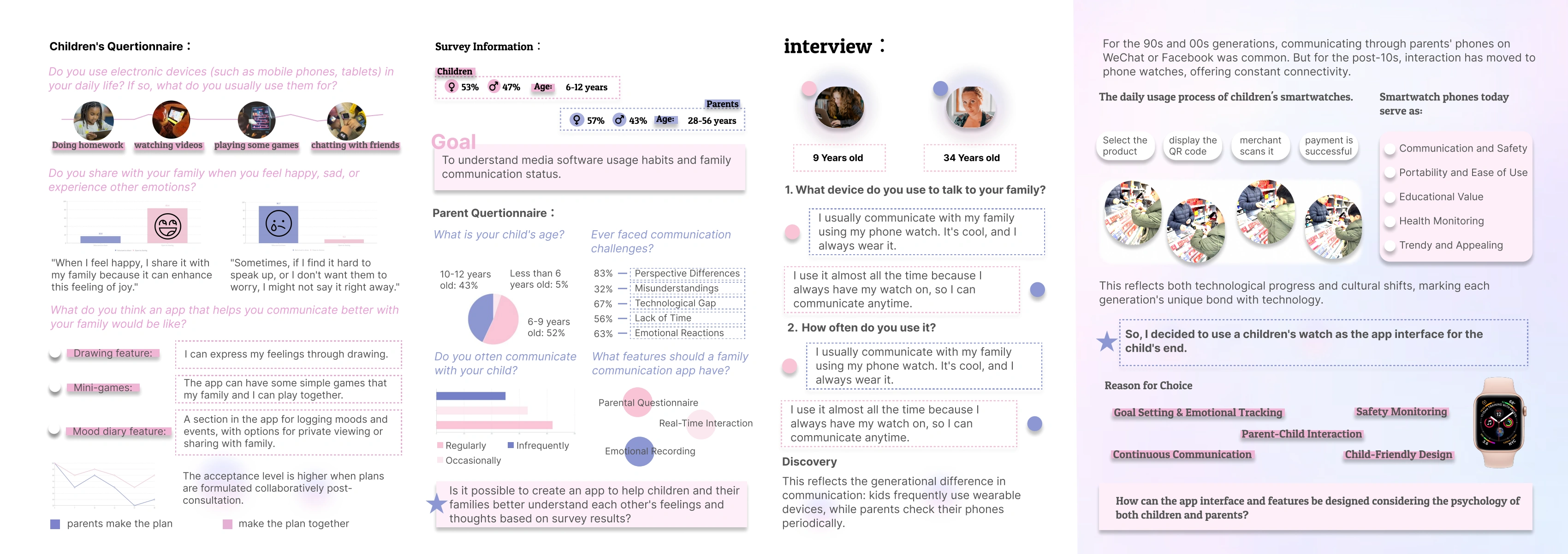
An argument between my younger sister and our parents reminded me of my own experiences. It led me to ask whether a simple daily mood record could make it easier for children and parents to start a conversation.
A child needs
A way to speak.
And a choice of when.
The questionnaire material describes children staying quiet when feelings are difficult to explain or when they do not want their family to worry. A mood diary with private and shared entries responds to these situations.
A parent needs
Context before advice.
The research looks at differences in how children and parents understand everyday communication. Shared activities give both people a way to respond and spend time together.
Let the child choose what to share.
Let both people decide what to do next.
Read the original research board
02 / Interaction design
One feeling.
A shared next step.
The original concept includes mood records, messages, voting and shared goals. This prototype develops the transitions between child and parent, including private entries, revised invitations and the option to decline.
Child
Express & choose
Record a feeling → choose its audience → respond to an invitation.
Only shared entries
cross this boundary.
Parent
Listen & participate
Acknowledge the feeling → suggest time together → agree on a plan.
Try it / A sample family scenario
Make a little
room for each other.
Start with a feeling. Follow the child and parent perspectives through one conversation.
- 01Record a feeling
- 02Acknowledge it
- 03Suggest time together
- 04Agree together
- 05Take part
- 06Reflect
About this step
A feeling belongs to the person recording it. Sharing is a separate, deliberate choice.
Proposed interaction refinement, using sample data. This demo stays on this page; no messages are sent.
Child’s space · Just for me
How are you feeling?
There is no right or wrong answer.
Choose a feeling to begin.
Save to the child’s diary. No parent notification. Sharing later remains optional.
Edit the activity or time, then ask both people to confirm the updated plan.
Close this invitation. No shared goal is created, and the conversation is preserved.
03 / Refined mobile interfaces
Interface design
for everyday mood records.
The original five-tab navigation, mood characters, goals, rewards and shared decisions remain. The revised screens use clearer typography, more space and softer separation between sections.
Design guidelinesColor / Typography / Mark & icons / Surfaces / Use & avoid / Applications+
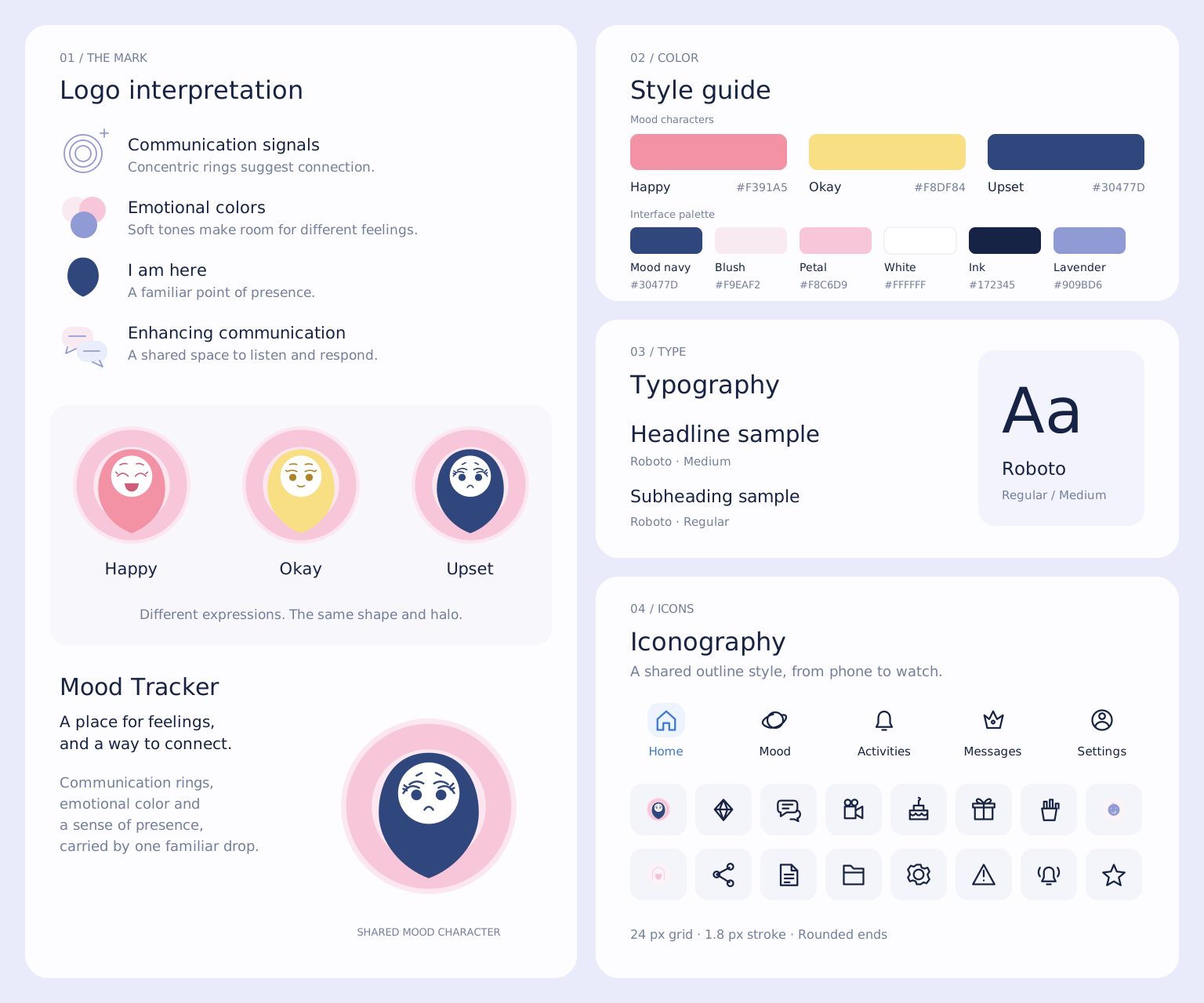
A system with room for every feeling.
Color, type and shape carry different responsibilities. These guidelines explain the visual decisions and how to extend them across the phone and watch.
Color names a feeling. It does not grade it.
The palette separates emotional expression from interface actions. The associations below are choices within this project, rather than universal meanings assigned to a color.

Coral / Happy
#F391A5A warmer, more outgoing accent for an expressive smile. Raised eyes and an open mouth distinguish the character.
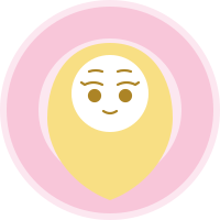
Butter yellow / Okay
#F8DF84A quieter accent for an ordinary, steady moment. Relaxed eyes and a small smile keep the expression distinct.

Deep blue / Upset
#30477DA deeper accent for a feeling that needs space. Worried brows and a downturned mouth communicate it without an alarm color.
Keep all three characters the same size. Always pair color with its own expression and a written label; never make “Happy” larger or more rewarded than another feeling.
Soft halo
#FCE7F0A shared quiet field around every character.
Communication ring
#F8C6D9The repeated ring suggests a feeling being noticed and received.
Blush surface
#F9EAF2Groups personal messages without a heavy outline.
Lavender accent
#909BD6Connects the calendar, large accents and progress graphics.
Ink
#172345Carries titles and important information on pale surfaces.
White
#FFFFFFKeeps faces and reading surfaces clean.
Functional color
A deeper lavender for actions.
Use #656DA8 for an active primary button with white text. Keep the pale #909BD6 for large accents, or pair it with dark ink. The deeper action color is already used in the live phone and watch prototype.
White on the pale lavender is only 2.68:1, so it is not a small-text pairing. The application examples here use at least 4.5:1 for normal text. This is a pairing check, not a claim that every historical board has passed an accessibility audit.
Roboto. Two weights, a clear hierarchy.
Retain the typeface from the original project. Regular handles reading; Medium identifies headings, actions and selected items. Hierarchy comes from size, spacing and weight together.
Phone artwork / 464 × 976 design units. Font sizes follow the current vector screens; line heights below define the rhythm for subsequent layouts. These are design units, not physical device pixels.
Spacing & alignment
Use left alignment for paragraphs and centre alignment for short action labels. Start with 1.45–1.6 line height for reading copy. Keep normal tracking for body text and tabular figures for dates and percentages.
Language & font integrity
Use real 400 and 500 font weights, without synthetic bold or horizontal stretching. Roboto covers the English interface; Chinese uses the system sans-serif fallback. Portfolio story headings belong to the website type system.
One silhouette. Three expressions.
The water drop holds the feeling; the surrounding rings represent a space for communication. Keep the construction consistent and change the expression together with its assigned color.
- Source grid
- 200 × 200; scale the complete SVG proportionally.
- Shared ring centre
- (100, 100); radii 100 / 94 / 65.
- Face
- Centre (100, 85); radius 35. Preserve the individual eyes and mouth.
- Clear space
- Reserve at least 0.15D around a standalone character.
- Small use
- Start at 40 px for the complete expression, then verify at actual size. The watch hero uses 92 px.
Softness comes from space, not texture.
Treat this as a digital surface specification. Flat color, live text and vector icons remain separate. Photography keeps its original image layer.
01 / Solid surfaces
Use pale pink or lavender to group content. Keep the centre of reading areas free of grain, heavy gradients and shine.
02 / Separate layers
Place text above the color block as editable text. Photos and character art sit in their own layers, so changing a label does not require repainting the background.
03 / Space & edges
Phone cards use 24 design units of outer margin and 18-unit corners. A 4-unit spacing step helps new layouts stay consistent; the live phone action is at least 48 px high.
Restrained shadows may describe the phone or watch shell in a presentation. They must not reduce text contrast or imply that glass, metal, straps or manufacturing finishes have been specified.
Consistency includes what stays out.
Use the same assets across the identity board, mobile screens and watch. The examples below are intentionally marked as correct or incorrect usage.
Use / a complete family
Keep distinct expressions with the same halo and proportions.
Avoid / stretching
Do not flatten the face, widen the body or crop the halo.
Avoid / color-only meanings
Do not use the same face for every feeling or rely on color without a label.
Avoid / low-contrast labels
Pale lavender with white small text loses definition; use the deeper action color.
Use / editable flat layers
Keep letterforms clean and preserve the source photography.
Avoid / display type in controls
Do not replace Roboto with the portfolio serif or add outlines and shadows to interface labels.
One identity. Different amounts of information.
The phone supports reading and reviewing. The watch supports a short decision in the moment. Share the identity without shrinking a whole phone screen onto the wrist.
Phone
- Keep the five original navigation items and full activity context.
- Use 28-unit artwork titles; the live prototype uses 25–27 px titles and actions at least 48 px high.
- Keep privacy, recipient and confirmation visible before saving or sharing.
Watch
- Show one primary task per screen and move long conversations to the phone.
- Current study: 92 px character, 20/24 px title, 12/18 px body and actions at least 42 px high. Validate final sizes on the intended watch.
- Use the same expressions, rings and Roboto weights as the phone.
Ready to choose
A clear label and a quiet surface invite a choice.
Selected
A border, check and label confirm the choice together.
Saved privately
Name the result and its audience; saving does not mean sharing.
An unavailable action stays inactive and explains what is missing. Confirmation is shown with a checkmark and words, not by turning a feeling into “Happy”.
Light and dark presentation
The product study currently uses light surfaces. Keep its colors and photographs intact inside either portfolio theme. A dark portfolio background is not a dark-mode app specification.
Views and material scope
This is an interface concept, so phone/watch layouts and interaction states are the relevant application views. Industrial three-view drawings, dimensions in millimetres and manufacturing finishes belong to a separate hardware-design scope.
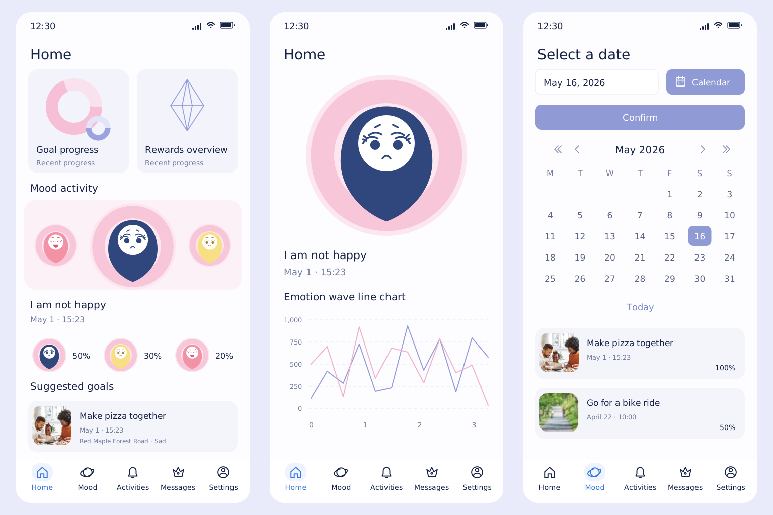
Review mood records.
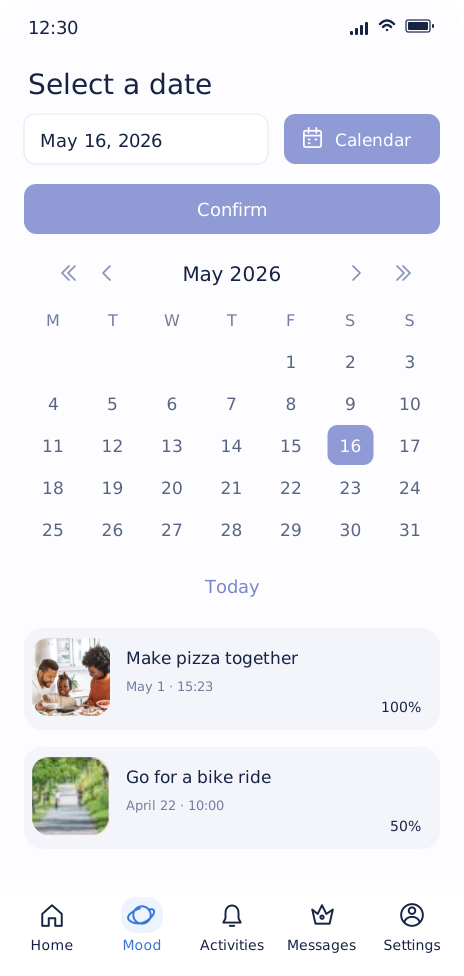
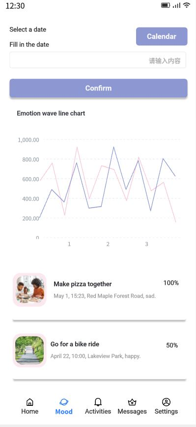
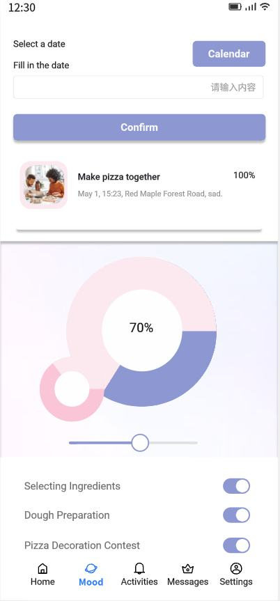
Mood activity, goal progress and rewards stay together on the home screen. The detail view keeps the emotion chart, while the calendar retains date selection and activity progress.
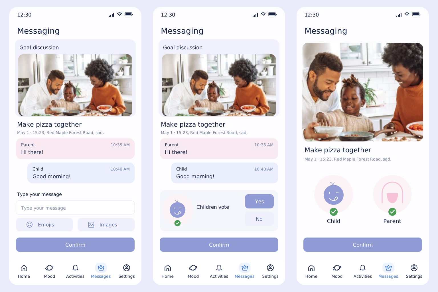
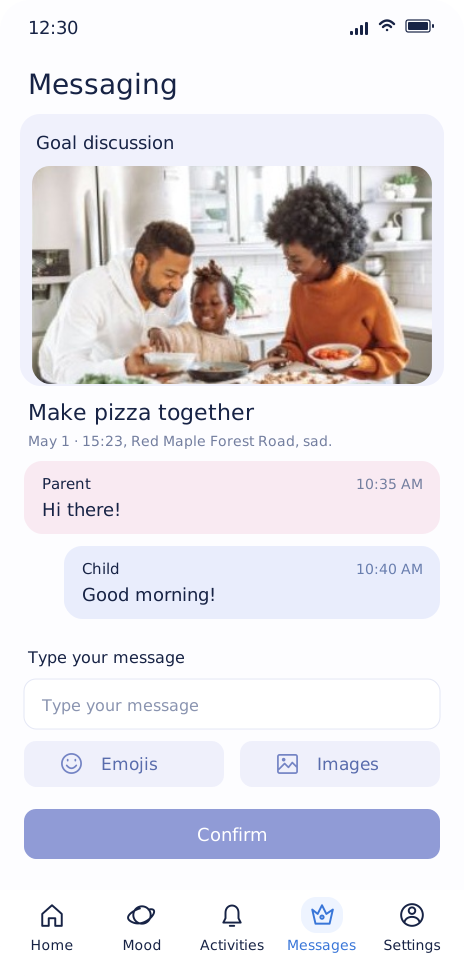
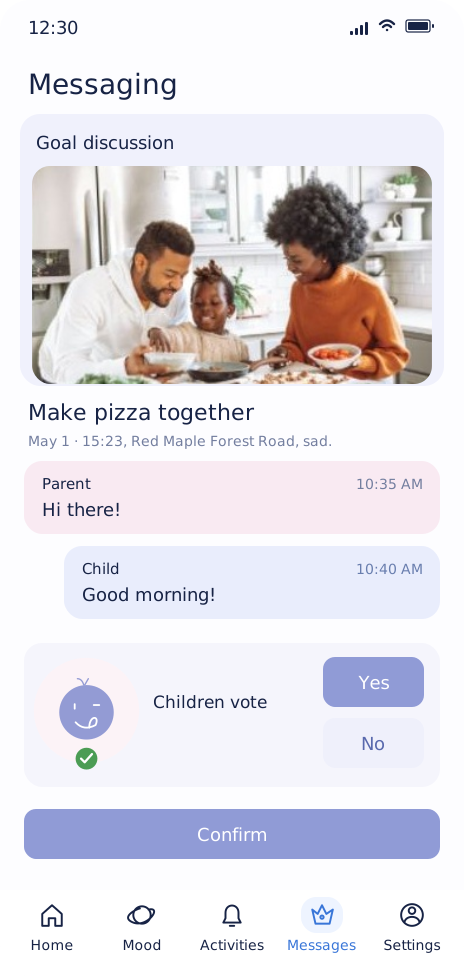
Discuss and confirm a plan.
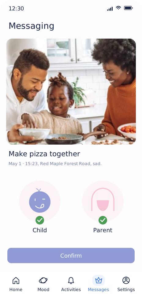
The original sequence stays intact: discuss an activity, let the child vote, then confirm together. Soft message bubbles replace heavy separators, and the choices are easier to scan.
Explore the six screens individually
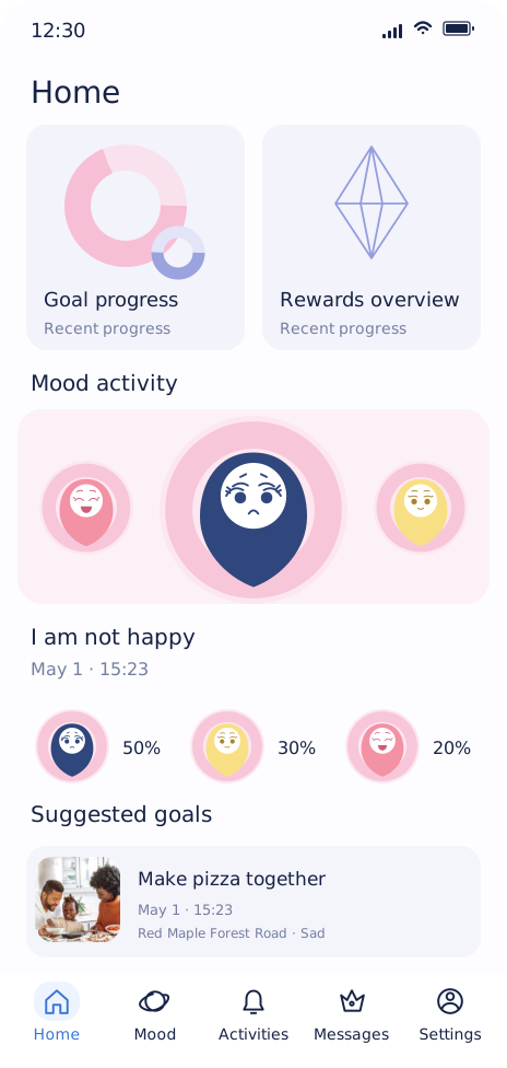
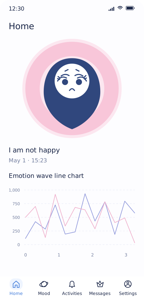
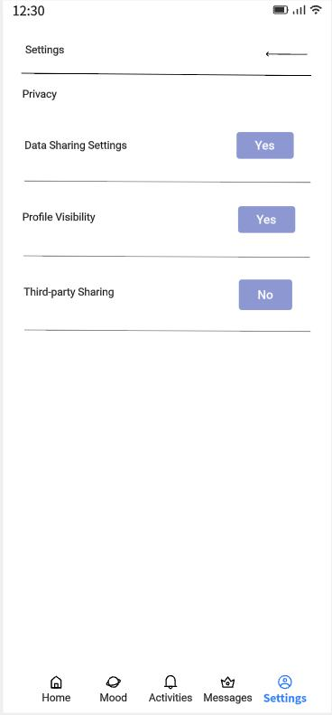
Explore the original progress, history and privacy screens
04 / On the wrist
Mood Tracker,
on the wrist.
The original watch concept becomes a quick companion to the phone: record a feeling, choose who sees it and respond to a shared activity. The same water-drop character stays at the centre.
A moment for you
How are you?
Choose a feeling to begin.
Try the watch
One task at a time.
Choose a sample scenario, then use the controls on the watch.
Choose a feeling on the watch. Nothing is shared yet.
Interactive concept with separate sample scenarios. No real watch connection or messages.
Choose a feeling first, then review who can see it. Every new record starts with “Just me”.
Accepting an invitation waits for the parent’s confirmation. “Not now” closes it without creating a goal.
Long conversations, calendar history and reward details stay on the phone. The watch keeps the next action close.
05 / Decisions & next steps
Protect the choice.
Support the conversation.
The revised flow treats mood records and activity progress separately. Both people agree before a plan starts, and reflection after the activity is optional.
- Sharing is explicit
- A new entry is private by default. The parent sees only an entry the child has chosen to share.
- A response comes first
- The parent acknowledges the feeling before suggesting an activity. “I can listen later” leaves a clear response instead of forcing the next step.
- Both people confirm the plan
- A proposal stays a draft until the child accepts and the parent confirms. Editing the activity or time resets that agreement.
- Progress tracks the activity
- Track the agreed activity, not whether a feeling becomes “better”. Reflection can be private, shared or skipped.
Source & scope
The original concept
and this prototype.
The original project includes questionnaires, interviews, information architecture, wireframes and mobile UI. The watch companion developed here extends its proposed child-watch direction using the original water-drop artwork. Both interactive demos are design explorations.
Next to test
Can each person
explain the next step?
Usability testing should check whether children understand who can see a record, whether both people understand a pending invitation, and whether changing or declining it is straightforward. These revisions have not yet been tested with users.
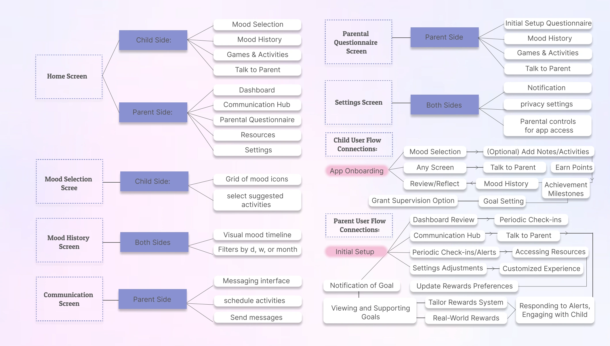
View the original information architecture
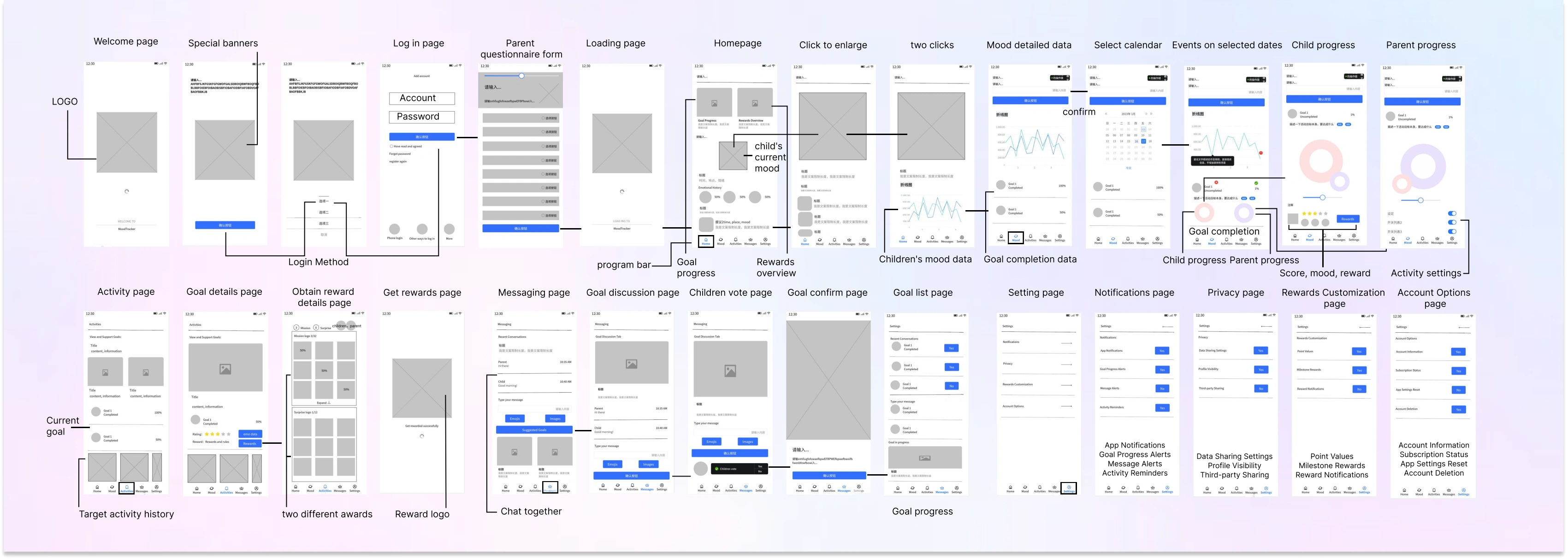
View the original wireframe journey
Next validation / Task planPlanned checks for the revised phone and watch flows.+
This is a planned usability check, not a completed study. Use fictional scenarios, ask participants to explain the next step in their own words, and record assistance, mistakes and unexpected interpretations.
Save privately
Record a feeling without sharing it. Check whether the person can explain who sees the entry and whether a parent is notified.
Change the plan
Change an invitation’s activity or time. Check whether both people recognise that the revised plan needs confirmation.
Decline without losing the conversation
Choose “not now”. Check whether the person understands that no shared goal starts and that the conversation remains.
Move between watch and phone
Record a feeling on the watch and explain where to continue a longer conversation. Check the perceived boundary between saving and sharing.
Use the observed problems to prioritise revisions, then repeat the affected tasks with a new prototype version. Report task-level observations alongside the number and type of participants.