Assistive product concept
The Stone Roses
More reach. More everyday possibilities.
Discover the project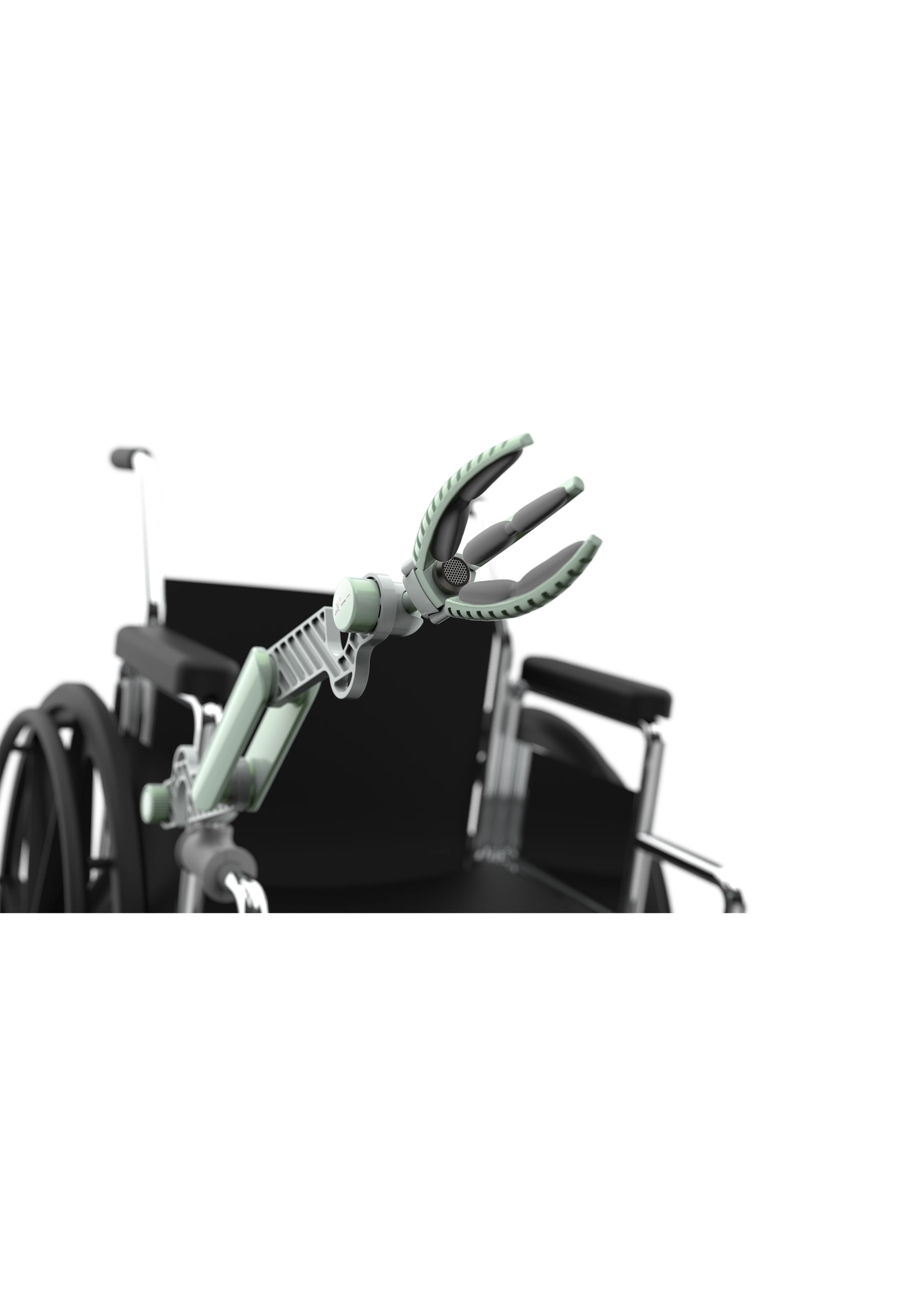
The project
Project overview.
A wheelchair-mounted assistive arm concept for reaching objects and handling everyday tasks. The project compares arm structures through task scenarios, physical models and 3D studies.
- Project type
- Academic project · Form & structure exploration
- Focus
- Task scenarios
Physical form studies
3D product visualisation
01 / Everyday tasks
Reaching beyond
the armrest.
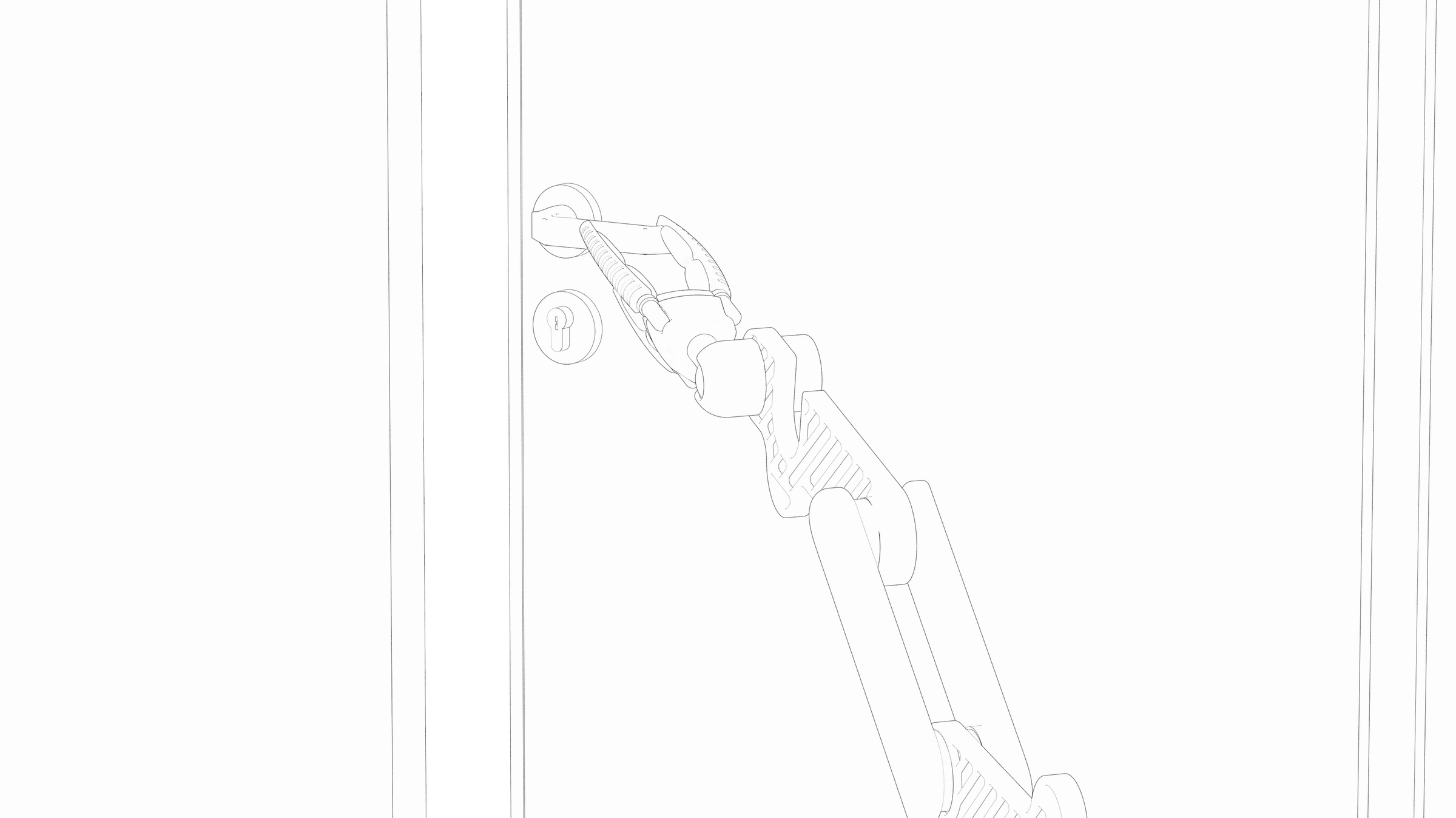
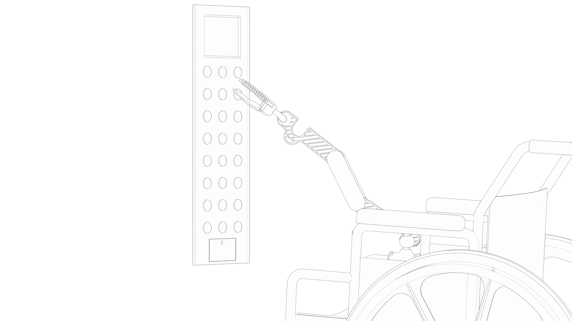
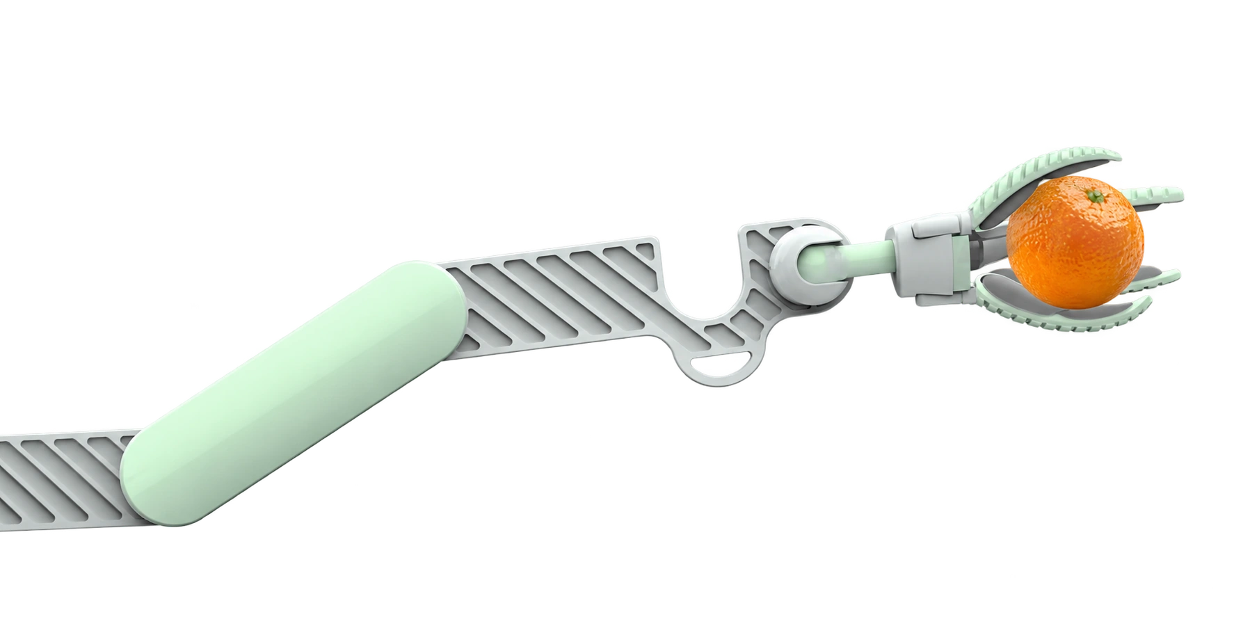
The project focuses on tasks that can be difficult to reach from a wheelchair: picking up an object, turning a door handle and pressing an elevator button. An attached arm is proposed as a way to assist with these tasks.
02 / Choosing a structure
Two, three,
or four sections?
Physical models compare the reach and size of two-, three- and four-section arms. The three-section version was selected as the best balance within this form study.
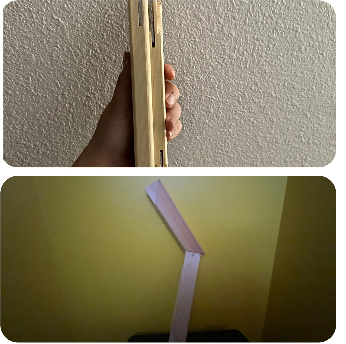
Compact, but short
The study found the length too short for the intended reach.
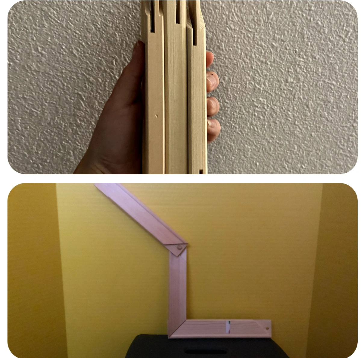
The selected direction
The chosen compromise between length and thickness.
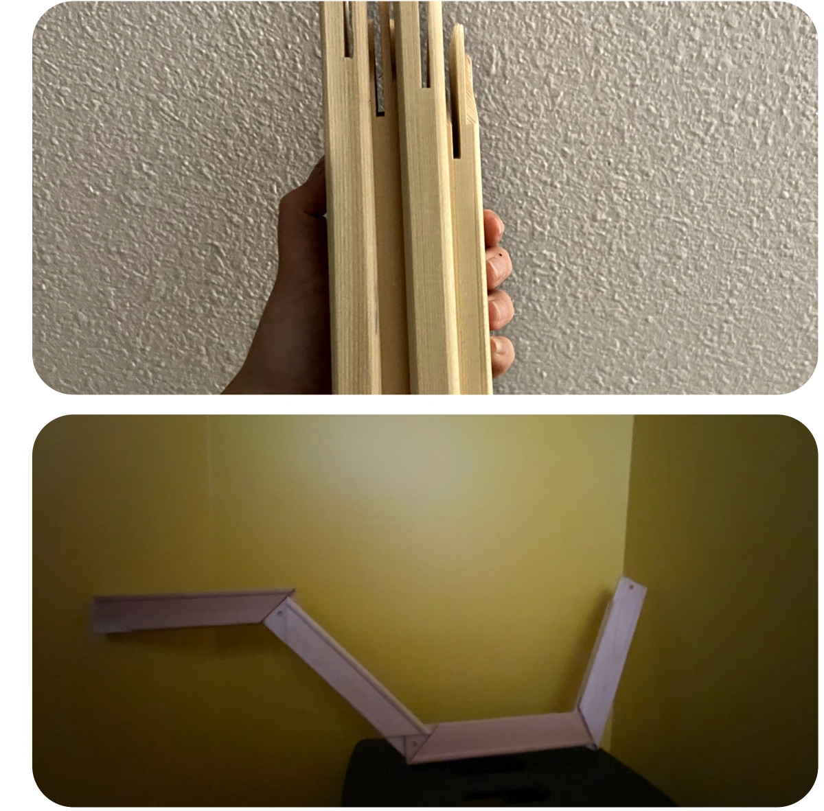
More reach, more bulk
The longer configuration introduced too much thickness.
03 / Form & mechanism
Developing the arm
and gripper.
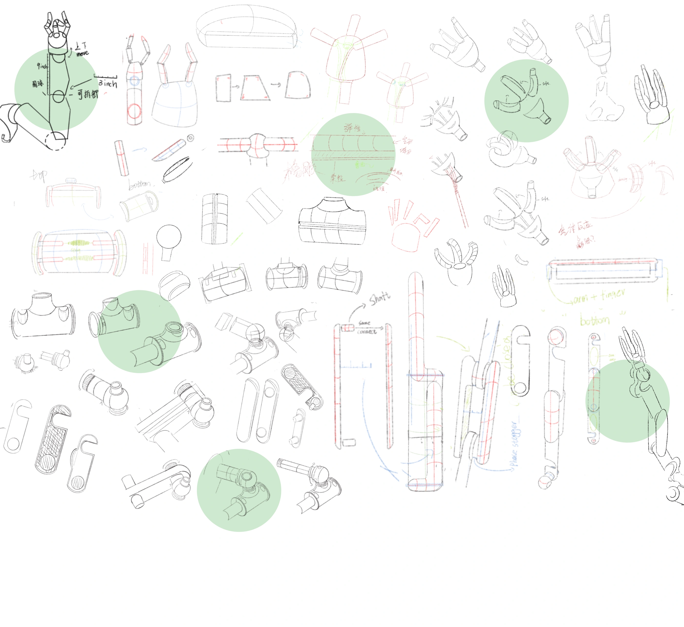
The sketches develop rounded joints, elongated arm sections and a three-finger gripper. They also explore how the gripper connects to the arm and how the arm attaches to the wheelchair.
Designed around the chair.
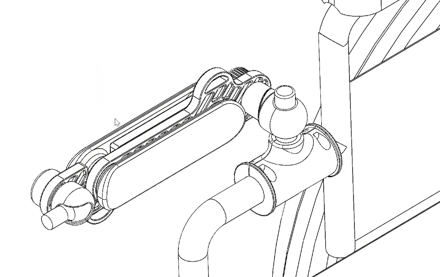
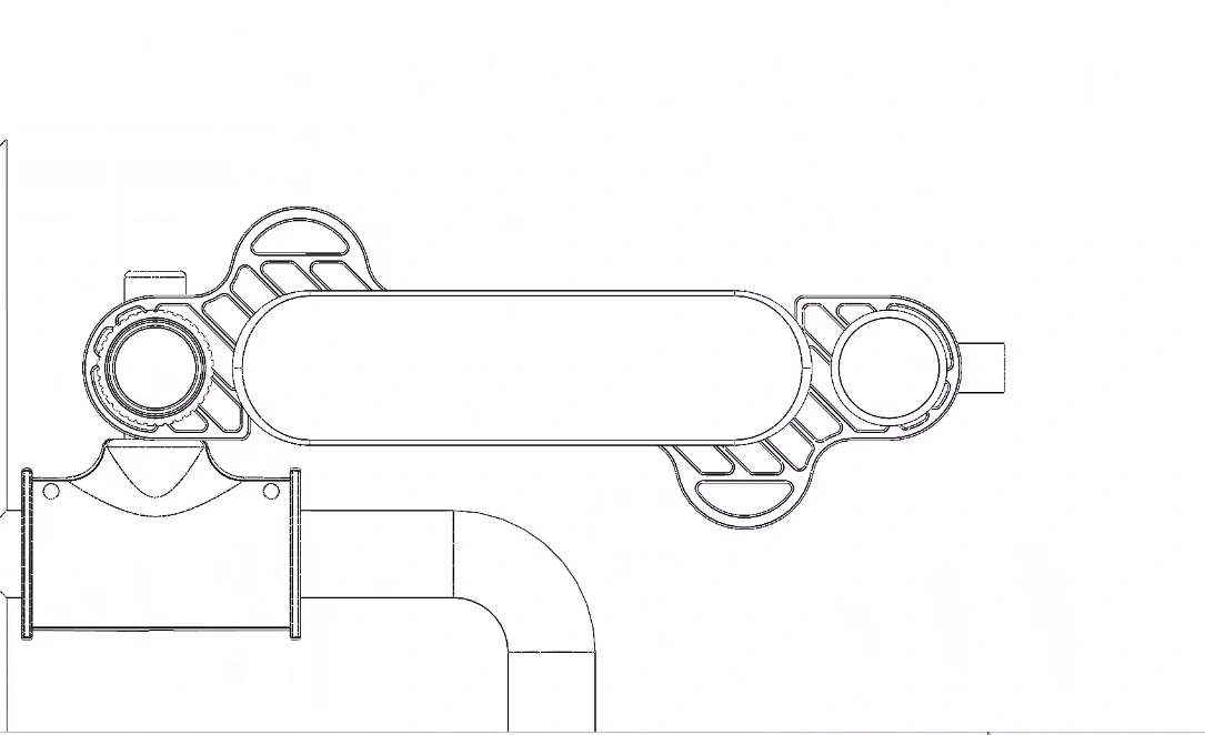
Digital models explore a folded position beside the armrest. The perspective and side views show the proposed attachment and how the arm sections sit together.
A softer approach
to holding.
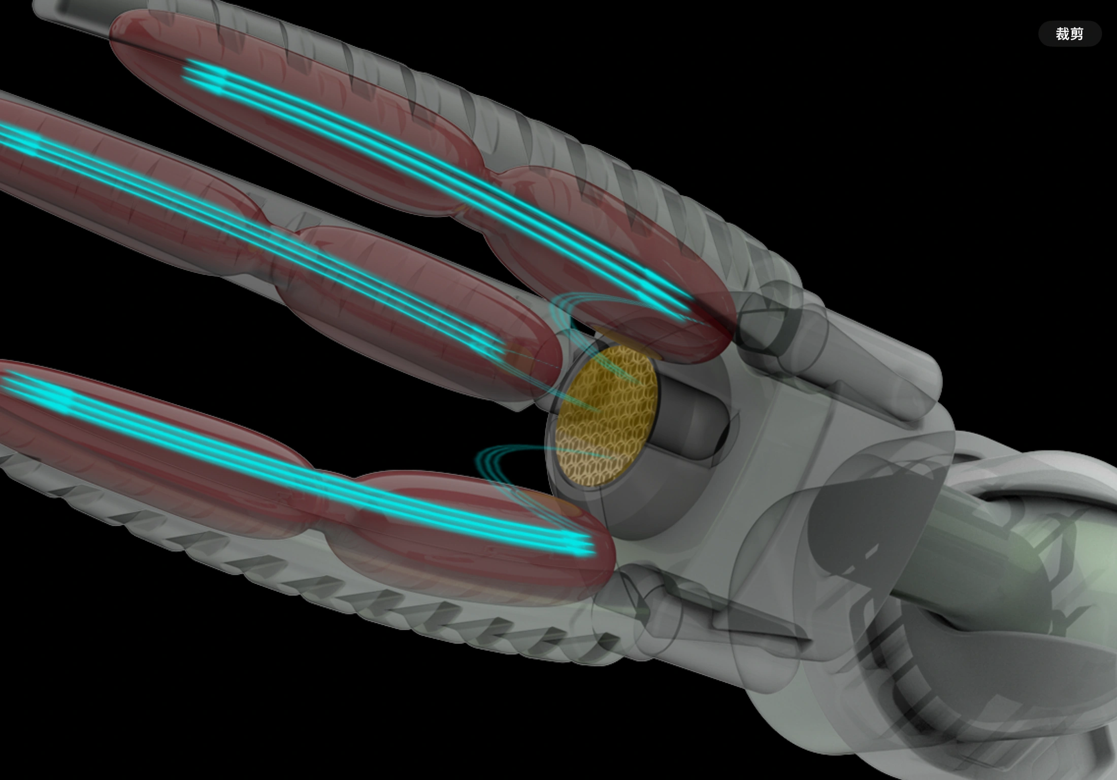
The proposed inflatable fingers curve around an object. A cutaway rendering explores this idea inside the gripper.
Design guidelinesIdentity / Color / Typography / Materials & views / Use & avoid / Applications+
A readable structure for an everyday assistive object.
A product-focused guide to the selected arm configuration, visual hierarchy, surface direction and presentation of mechanical studies.
The project is a form and structure concept. Appearance and documentation rules are separated from unverified engineering dimensions and performance.
Preserve the selected configuration.
The recognisable elements are three arm sections, rounded joints and a three-finger gripper. Keep the same configuration in sketches, folded views and task scenarios.
- Arm configuration
- Carry the selected three-section direction into final presentation; label the two- and four-section studies as alternatives.
- Gripper continuity
- Keep three fingers, their relative arrangement and the joint connection consistent across views.
- Project type
- Show the arm together with the chair or a familiar object when explaining reach.
- Annotations
- Use short leaders and one numbering system. Avoid crossing the gripping area or hiding a joint.
Use contrast to explain what each part does.
The original render combines pale green surfaces with grey mechanics and a dark chair. The hierarchy helps the arm remain readable as part of a larger object.
#BCD4C6Pale green / Contact direction
Carries the softer surfaces visible in the concept, especially the fingers and outer arm panels.
#7D8882Structural grey / Mechanism
Distinguishes joints and connecting elements without turning every edge into an accent.
#242A28Charcoal / Context
Keeps the chair and contextual objects visually behind the proposed arm.
#F2F6F3Paper white / Documentation
A clear field for sketches, dimensions and annotations.
These are reference colors for presentation, interpreted from the render. They do not specify a coating system, a material grade or a functional safety code.
A readable color pair
Pair color with words or a visible symbol. Keep small labels on a quiet, solid surface.
#F2F6F3 / #242A28 · 13.40:1Patua One for headings. Inter for explanations.
Patua One gives the project headings a distinct, substantial shape. Inter keeps the supporting explanation quiet and readable beside structural drawings.
Patua One + Inter
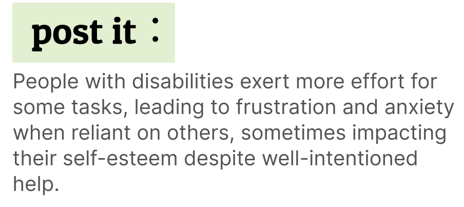
The Figma text layers confirm Patua One Regular for “the principle of archtype” and Inter Regular for the supporting paragraph. The original board at left preserves their visual relationship.
| Text role | Source size | Typeface / style | Original text |
|---|---|---|---|
| Section heading | 22 px | Patua One / Regular | The principle of archtype |
| Supporting paragraph | 12 px | Inter / Regular | People with disabilities exert… |
Use the heading face for short titles and Inter for longer explanations. Keep diagram labels away from component contours; preserve the original artwork where text is part of an image.
These are source-board measurements, not website or installation text sizes. View the original Figma file ↗
Separate surface intent from engineering selection.
The render suggests smooth outer panels, softer gripping surfaces and mechanical connections. A material guide should explain those roles before naming an untested substrate.
Outer panels
Use a restrained matte appearance to make the silhouette legible. Keep seams and joint boundaries visible.
Gripping surface
The inflatable-finger direction calls for a compliant contact study. Verify deformation and release in a physical prototype.
Connections
Keep metallic or rigid connections visually distinct from soft contact areas. Material and fastening choices remain engineering work.
Surface samples are schematic illustrations of the proposed appearance.
Show how the arm fits beside the chair.
The source includes folded perspective and side views. Keep their labels accurate, then add missing front and top projections when a consistent model is available.
- Side view
- Describe the folded arm beside the armrest and the height of the mounting position.
- Front view
- Show lateral projection, chair clearance and the relationship to the seated person.
- Top view
- Show the footprint, turning space and the difference between folded and extended states.
- Gripper section
- Explain the finger concept and connection. Add dimensions only after the mechanism is defined.
Keep the character of the work.
These examples make the application rules visible. All distorted or crowded samples below are labelled as things to avoid.
Compare at a consistent scale
Keep alternative arm studies on a common baseline and label their differences.
Avoid altered proportions
Do not stretch an arm image to fill a presentation frame.
Keep a task reference
Use a door handle, button or held object to explain the intended action.
Avoid hidden attachment points
Do not crop the mount when explaining how the arm connects to the chair.
Distinguish study from result
Use captions such as form study, proposed mechanism and concept rendering.
Avoid unsupported performance
Do not add load, speed or reach figures that the prototype has not established.
A task sequence, not an isolated product image.
Future demonstrations should show the full transition between storage, approach, contact and release, with the same chair and arm configuration.
Keep the intended target and chair visible in one frame.
Explain the position and approach, not only the final pose.
Show the finger relationship and leave room for a release explanation.
Suggested behavior & continuity
Stowed
Show where the arm rests beside the chair.
Approach
Keep the target and motion direction visible.
Contact
Explain the intended finger contact without implying a measured force.
Release
Show how the object is set down and the arm returns.
04 / Scope & reflection
What the form study covers.
What still needs testing.
Explored
Task scenarios, arm configurations, physical form models and gripper design studies.
Next to validate
Mounting, control, load capacity and real-world use with wheelchair users would be essential next steps for a working assistive device.