Interactive installation & storytelling
Ms. Tomato
The Misunderstood Life of Ms. Tomato.
Discover the project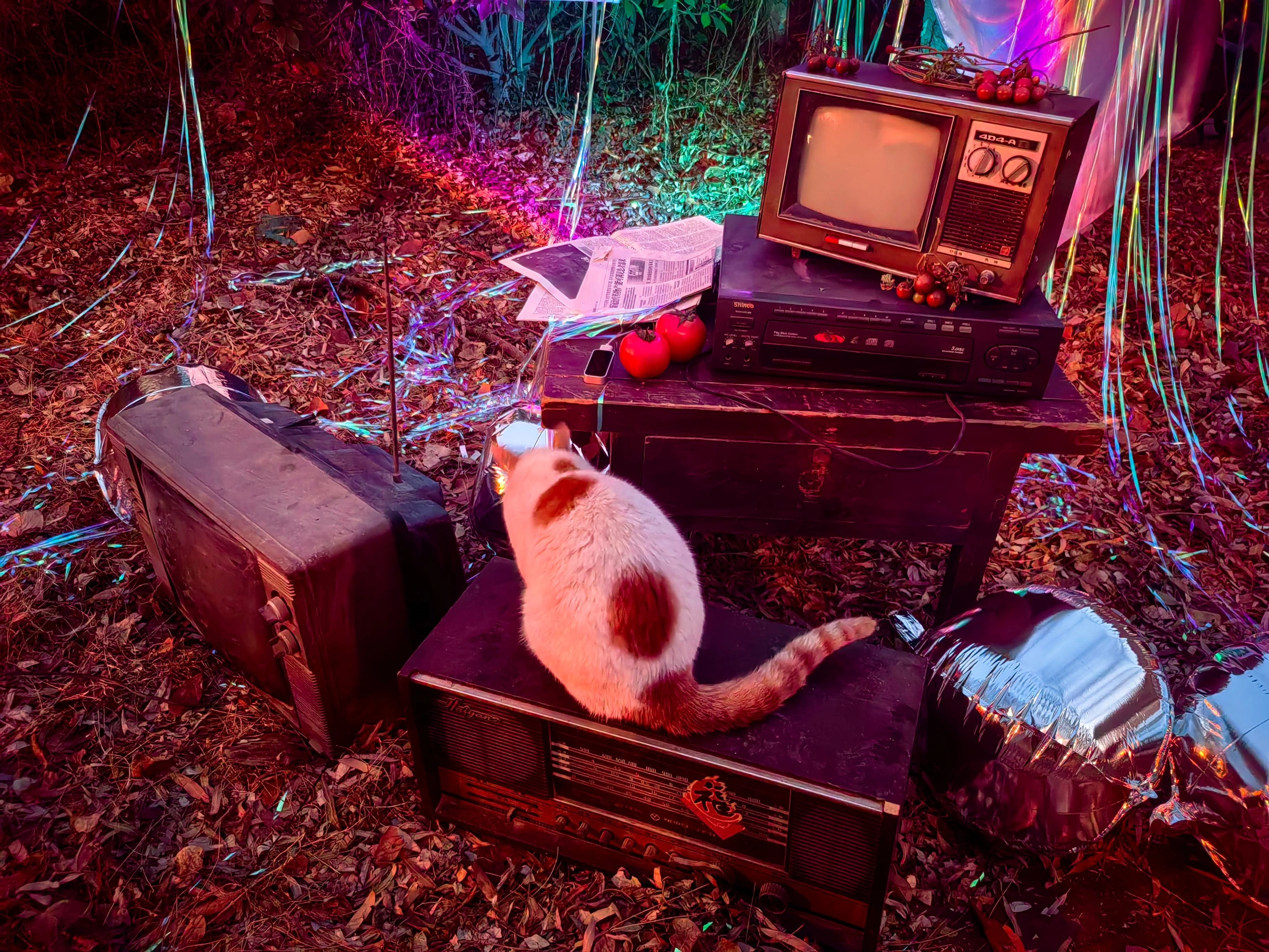
The project
Project overview.
An interactive installation about how assumptions shape the way a character is seen. Ms. Tomato’s life unfolds through a physical set, gesture input and realtime imagery.
- Project type
- Academic project · Interactive narrative
- Focus
- Spatial storytelling
Gesture interaction
Blender & TouchDesigner
01 / The installation
Step into
Ms. Tomato’s world.
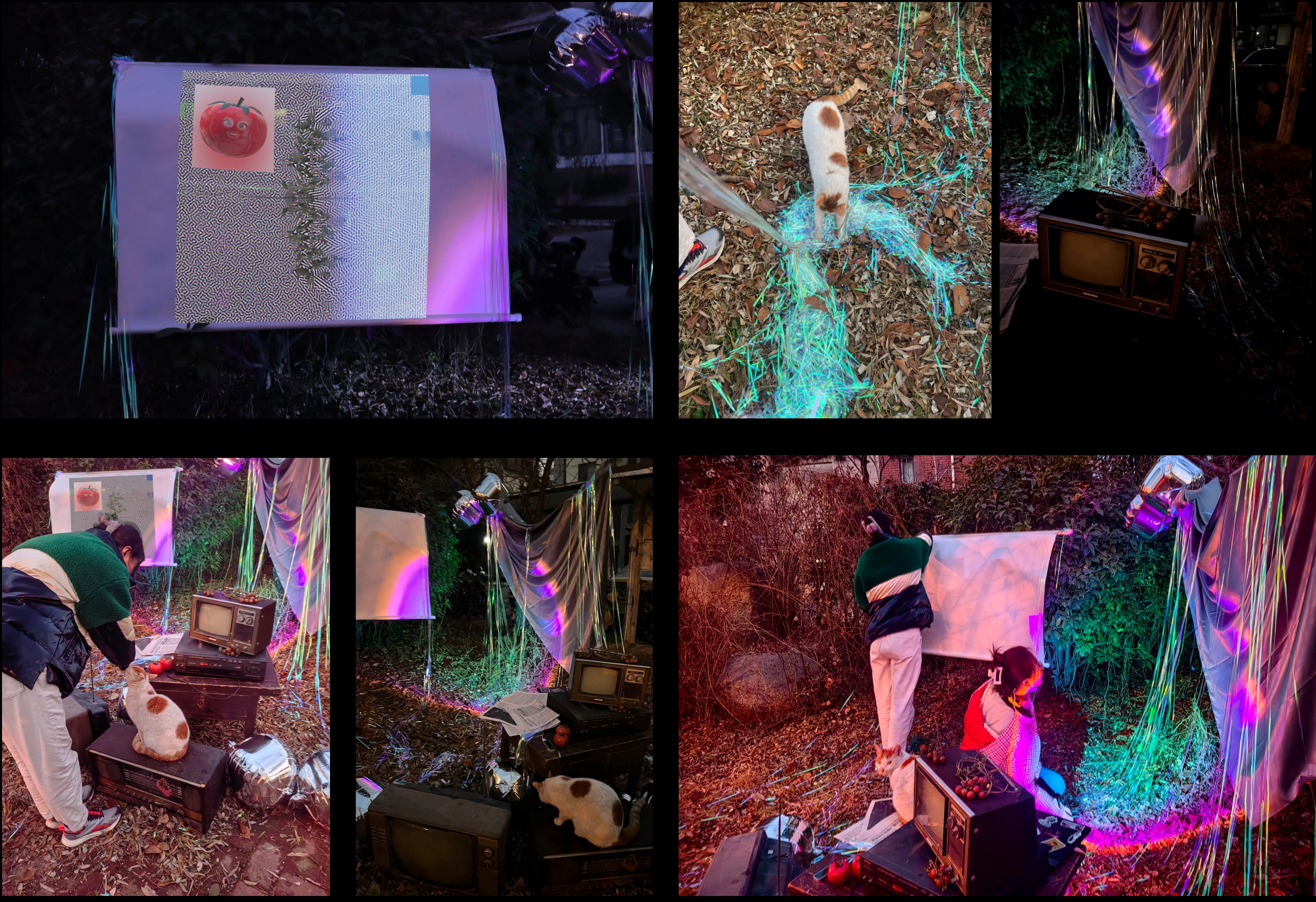
A television, scattered objects and colored light form the installation. Visitors use gestures to interact with the digital character’s story within this physical setting.
02 / Three chapters
Three stages of life.
Repeated misunderstandings.
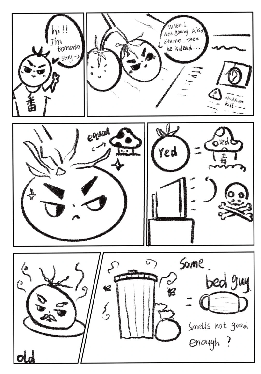
A first misunderstanding.
An encounter turns an unfamiliar fruit into an object of suspicion.
The same assumption, repeated.
People repeat an assumption before they get to know the character.
A different appearance.
This chapter explores how changes in appearance lead to further rejection.

Design guidelinesIdentity / Color / Typography+
A character you meet, in a space that responds.
Extend the character study into a practical guide for color, screen copy, set materials and the interaction sequence.
The guide is based on the documented installation and character studies. Screen colors, type sizes and state behavior are proposed presentation rules, not measured lighting or tracking specifications.
One character, across a changing life.
Keep the fruit silhouette, stem and facial placement consistent. The growth study documents visual development; the story itself follows childhood, adulthood and old age.
- Recognition
- Keep the silhouette and stem readable through changes in pose and light.
- Facial expression
- Change eyes and mouth to support the scene while preserving their relationship to the face.
- Life chapters
- Use narrative and posture to distinguish childhood, adulthood and old age without attaching a moral rank.
- Continuity
- Keep the character scale and screen position stable around an interaction cue.
Let the character stand apart from the atmosphere.
The red tomato is the narrative focus. Purple and cyan light frame the surrounding set, while darker areas give the face and screen room to remain visible.
#C63B45Tomato red / Character
Preserve the recognizable fruit color across the character studies and presentation.
#B754B8Purple / Atmosphere
Use around the set to add depth without tinting every face or subtitle.
#65C7CCCyan / Counterpoint
A cooler spatial accent that separates objects and light layers.
#19131BDark stage / Space
Anchor the environment and make the luminous screen readable.
#F4E8D9Warm white / Text
Use for short prompts and subtitles on a dark screen.
HEX values are reference colors for digital presentation. Stage lighting must be adjusted on location; life stages should be identified by story context, not a simplistic good-or-bad color code.
A readable color pair
Pair color with words or a visible symbol. Keep small labels on a quiet, solid surface.
#F4E8D9 / #19131B · 15.12:1Inter, with weight doing the work.
The original chapter labels and narrative paragraphs share Inter. Bold labels on cyan introduce each scene; regular white copy on the dark board carries the story.
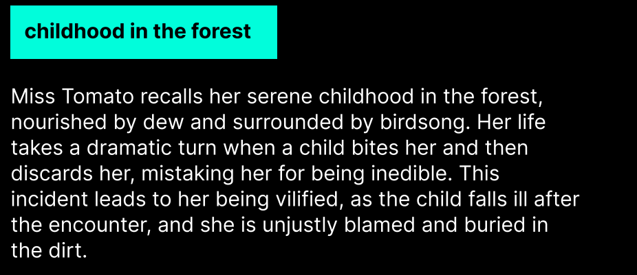
Inter Bold + Regular
Figma confirms Inter Bold at 12 px for “childhood in the forest” and Inter Regular at 12 px for the paragraph beginning “Miss Tomato recalls”. The hierarchy comes from weight, placement and background color.
| Text role | Source size | Typeface / style | Original text |
|---|---|---|---|
| Chapter label | 12 px | Inter / Bold | Childhood in the forest |
| Narrative paragraph | 12 px | Inter / Regular | Miss Tomato recalls… |
Retain Inter for new chapter labels and explanatory copy. Installation prompts need a separate size check on the actual screen, at the intended viewing distance.
These are source-board measurements, not website or installation text sizes. View the original Figma file ↗
03 / Making the interaction
Building the gesture
and visual response.
Gesture, character, image.
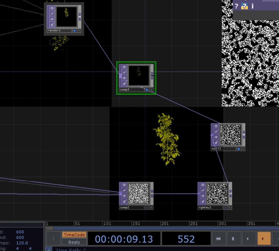
The project combines Leap Motion gesture input, character development in Blender and image processing in TouchDesigner.
- Leap Motion
- Hand-gesture input
- Blender
- Character and life-stage animation
- TouchDesigner
- Realtime image processing
Design guidelinesUse & avoid / Materials & views+
Keep the character of the work.
These examples make the application rules visible. All distorted or crowded samples below are labelled as things to avoid.
Keep a single prompt
Use one clear instruction at the moment it is needed.
Avoid light over reading areas
Do not let colored glare obscure a face, subtitle or action cue.
Make chapter changes gradual
Use a brief transition and keep the viewer oriented.
Avoid abrupt flashing
No repeated flashes or sudden full-screen brightness jumps.
Acknowledge a recognised gesture
Respond only when the input is recognised; show how to try again when needed.
Avoid repeated triggers
A held gesture should not repeatedly restart the same chapter.
Objects hold the scene. Light changes its mood.
The documented set combines older screen equipment, everyday objects, wooden supports and reflective material. Their roles should stay clear when rebuilding or photographing the work.
Found objects
Keep wear and texture where they support the lived-in atmosphere. Avoid visual clutter around the interaction entry.
Reflective surface
Use reflected color at the edges of the scene; keep bright highlights away from faces and reading areas.
Emissive screen
Balance the screen against ambient light so the face, prompts and subtitles stay visible.
Surface samples are schematic illustrations of the proposed appearance.
Explain the space and the signal path.
Audience view, layout and equipment relationships are more useful here than three views of the character. Leap Motion input and prebuilt Blender assets feed the TouchDesigner composition.
Live hand input
Prebuilt character assets
Realtime composition
Character & story
- Audience view
- Show the screen, character and interaction entry from the intended viewing position.
- Layout plan
- Document object footprints, visitor position and sensor placement when the actual site is confirmed.
- Signal diagram
- Separate live hand input from prebuilt character assets; show both entering the realtime composition.
- Equipment view
- Show screen orientation, cable routes and sensor line of sight from the actual setup.
04 / In the space
The installation,
in use.
These photographs document the screen, objects, lighting and audience interaction in the installation.
Design guidelinesApplications+
A clear beginning, a response, a way back.
Define state changes before adding effects. The rules below propose interaction behavior without assigning new gestures that the original project has not documented.
Keep the relationship between life chapters and the visitor response visible.
Label inputs, composition and output without implying unverified gesture accuracy.
Review the complete scene from the visitor position before finalising light and text.
Suggested behavior & continuity
Invitation
Keep the opening scene calm with one readable invitation.
Input recognised
Show a restrained confirmation; if tracking is lost, explain how to resume.
Chapter playing
Keep the story stable and prevent the same held gesture from restarting it.
Return to start
Give the ending a pause before a gradual reset for the next visitor.